La Fonda Del Sol Menu

I thought I would start with something classic and what a better way to do it than with the great master and acclaimed designer Alexander Girard. This is a Dinner Menu Design for La Fonda del Sol Restaurant in New York circa 1960. It is an offset lithograph with wonderful vibrant colors. I can almost say the work done for this restaurant (specially the suns) are one of his most celebrated and recognized designs. This menu has also been featured in many museums such as the SFMOMA. So here are some closeups of the type and full shots of the menu. Enjoy!

Europe is $52 Away!

Vintage KLM Royal Dutch Airlines Pamphlet. Designer Unknown. I like the colors, very 60’s. Reminds me of Alexander Girard’s color schemes. Love the use of Eurostile and the cut out faces. Looks 500 times better in person.

Design: Unknown  |  Year: 1962  |  Photos: Javier García

More images after the jump…

Continue reading “Europe is $52 Away!”

Alvin Lustig Bach Vivaldi

lustig_bach_2

lustig_bach_3

Here’s another Haydn Society record from my all time favorite, Alvin Lustig. This cover is very simple yet very different from the others. The circles make it look very modern and minimal while at the same time it helps reiterate the two composers distinction by changing its color.

Hope you all enjoy this as much as I do and stay tuned for more…

Designer: Alvin Lustig   |   Year: ?   |   Photos: Javier García

King Solomon

king_0.jpg

king_1.jpg

king_2.jpg

Here’s a great example of design from the early 60’s for the King Solomon Restaurants. The identity wonderfully integrated into exterior signs, menus, packaging and more. I love how the square Extended Eurostyle typeface integrates with the shapes if the icon.

Enjoy!

Design: Sy Edelstein   |   Year: 1963   |   Photos: Scanned/Unknown

Norman S. Ives Typographic Bach

ives_bach_2.jpg

ives_bach_3.jpg

I’ve been holding this one up for quite a bit as my blog was turning into an LP archive but after switching up a bit here it is:

For those who don’t know. Norman Ives was a graphic designer former student of Josef Albers at the Yale University where he also began teaching afterwards.

During the mid-to-late 1950s he worked with Herbert Matter on numerous design projects, including work for the New Haven Railroad, and Knoll International.

He is mostly known for his collages, wall reliefs and silkscreen prints.

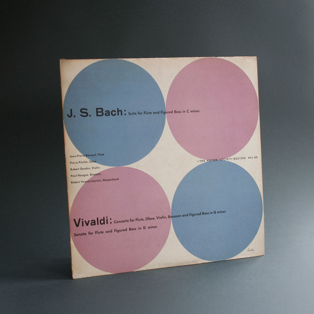
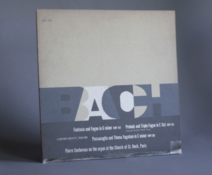
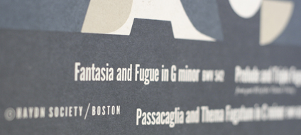
This cover here features his love for letterforms. This was probably some of his earlier work since it was produced in 1955 and he received his MFA degree in 1952. In any case this is merely one of the coolest record covers I have.

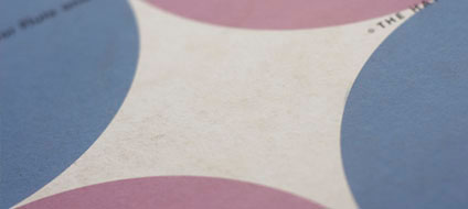
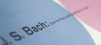
The Paper is off white and the letters are overprinted in a cool gray color and white ink which looks very nice against the paper. The letters aren’t perfectly shaped. If you get close they appear to have been drawn by hand almost like paper cut out. The only straight lines are on the letter A and H. Lots of white space. A great modern typographic approach to a classical record.

About Norman S. Ives:
Bio on Francisfrost
AIGA Constructions and Reconstructions Exhibit
Bio on Ewardcella

Design: Norman S. Ives   |   Year: 1955   |   Photos: Javier García

Product Info:
Haydn Society Album Covers, 1955
Copyright 1955 by the Haydn Society, Inc.
Boston Massachusetts
Cover Design by Norman S. Ives

Alvin Lustig PostWar Architecture

Here’s another wonderful book designed completely by Alvin Lustig. Amazing Layouts and typography is showcased in this book not to mention all the great architects featured in it. The photo’s tonal range is exceptional due to the heliogravure process.

Book was made in 1952 by The Museum of Modern Art, New York.

Design: Alvin Lustig   |   Year: 1952   |   Photos: Javier García