Long Live Dcmts

This post is to commemorate the life of a good friend and a fellow collector and design historian who did a great public service not only to the graphic design community but to all modernist collectors and enthusiasts. He was the originator of the #thriftbreak tag which was one way of him looking to help out anyone in the collector world by creating a community to ID design pieces as well as a platform for people to share their finds. This is something that a lot of knowledgeable dealers would look down on. He believe in making design accessible to anyone and he documented his finds and research on his blog Ars Longa.

He later started New Documents AKA dcmnts which was an account created to share important 20th century graphic design objects as well as some pieces he was selling but eventually he closed his shop and decided to make it an archive of his personal collection which eventually led to a great exhibit called the Shape of Sound curated by him for Civilization which I wish I had seen in person. As a fellow blogger and researcher I know the amount of work it takes to acquire, research and document each piece and it’s important that people do that. Dcmnts is his imprint on design.

We connected very early on through this blog as we both were graphic designers collecting similar design ephemera as well as other modernist pieces of art, homewares, etc. We shared many conversations around it and we also traded records and book covers (even some punk tapes). At that time we might have been the only ones interested in Joseph Low‘s work when I first unearthed some records as we shared back and forward thoughts and pieces from our collections. He also contributed by sharing info and ID-ing many pieces on this blog.

Scott, passed away April 27, 2020 due to cancer. He was a kind and giving person and his work will endure in our minds (and in the hard drives of designers) and hopefully in the formation of future designers and enthusiasts as it provides a great source of design history. He donated his collection to The letterform Archive in San Francisco and will be available for viewing soon.

Rest in peace dear friend.

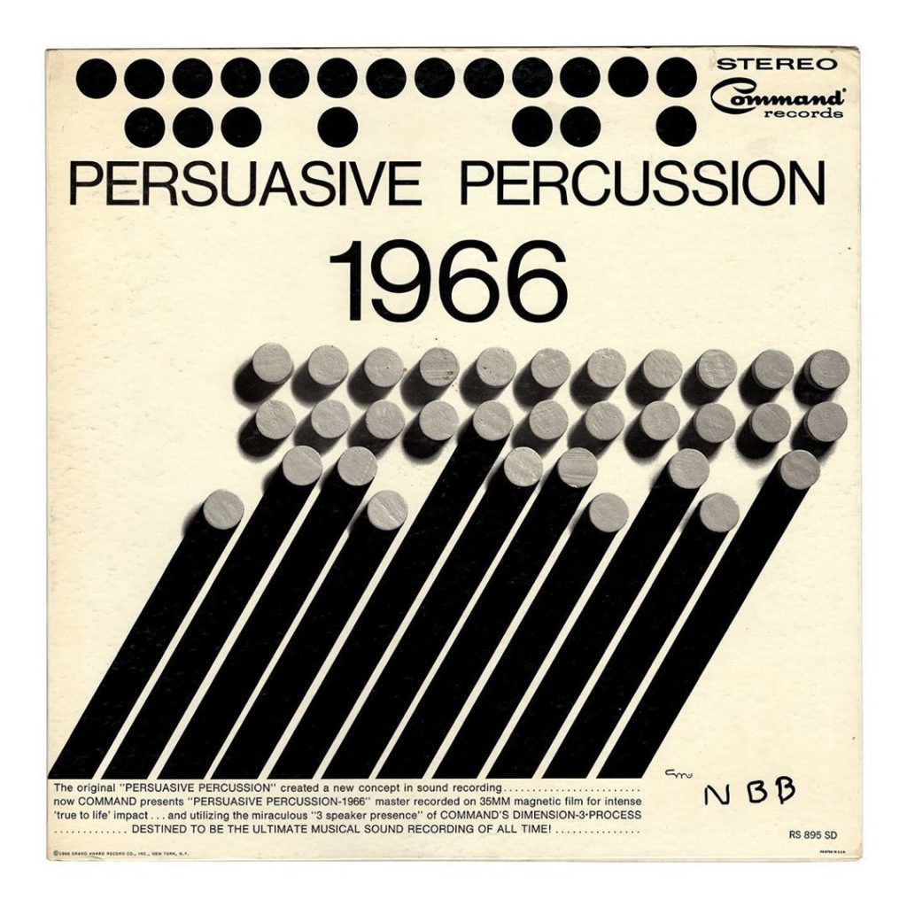
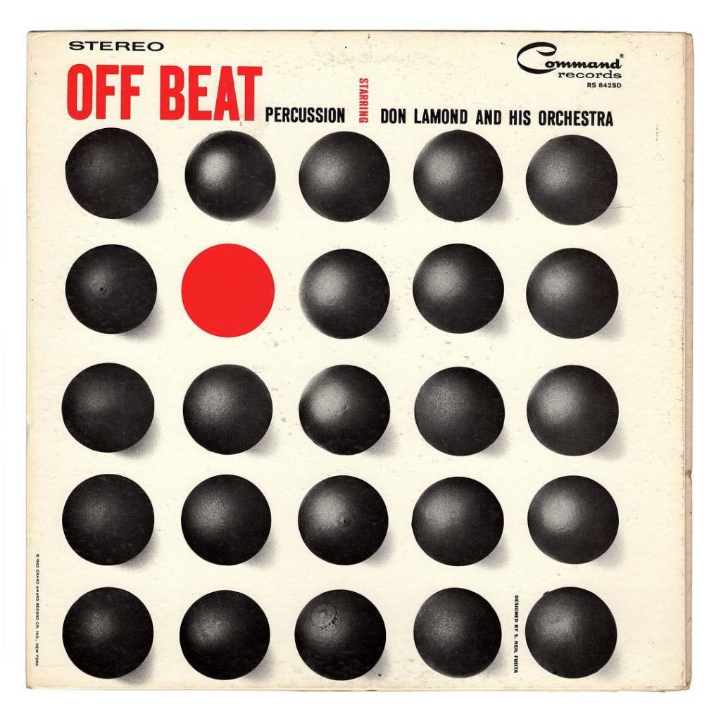
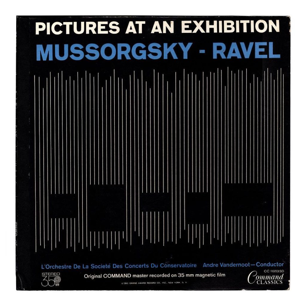
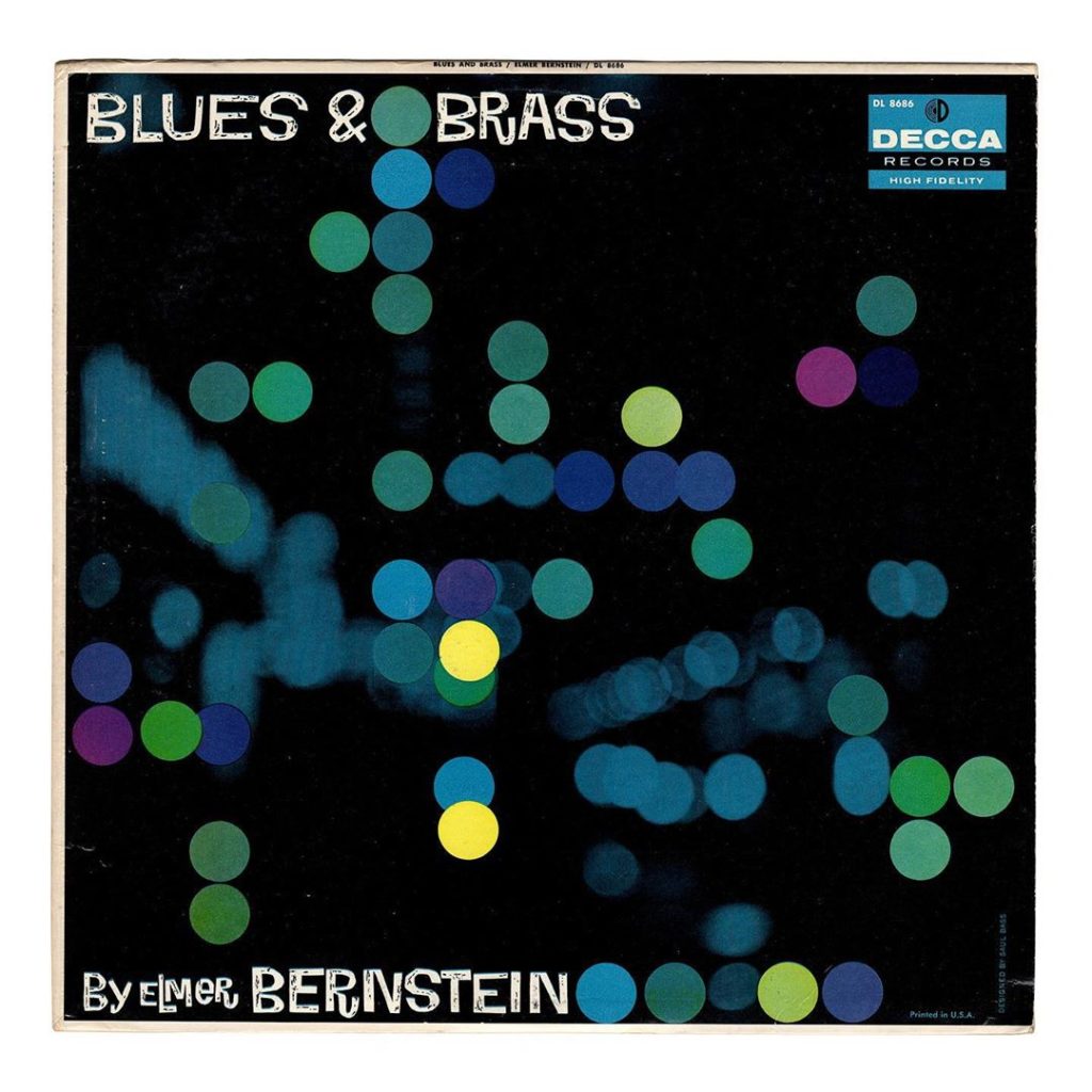
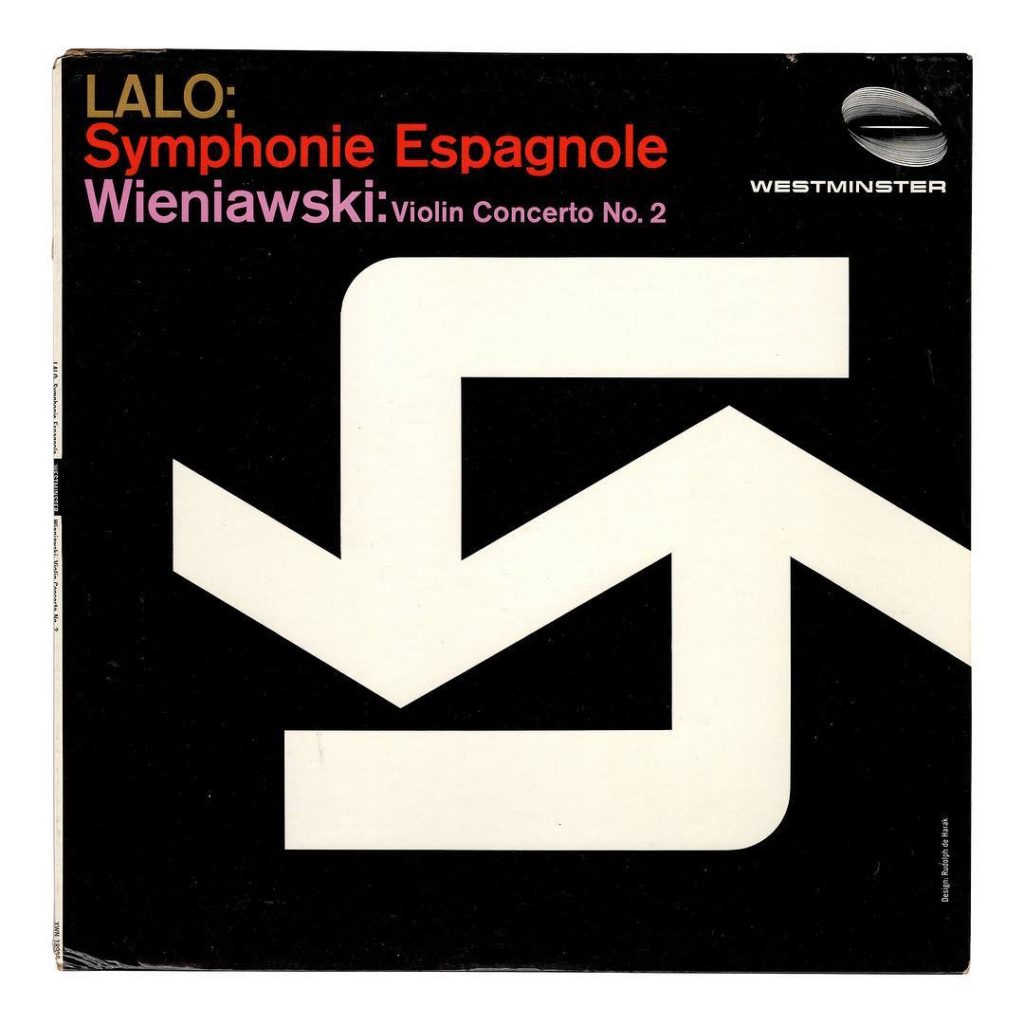
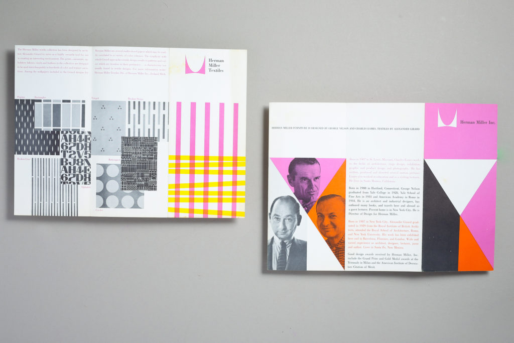
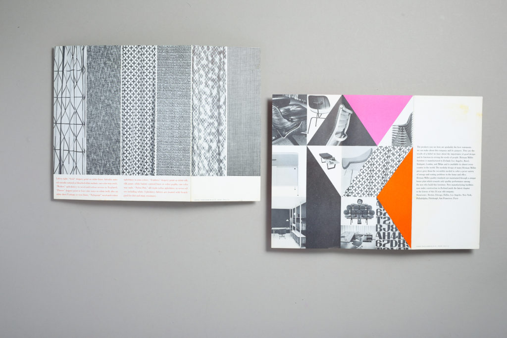
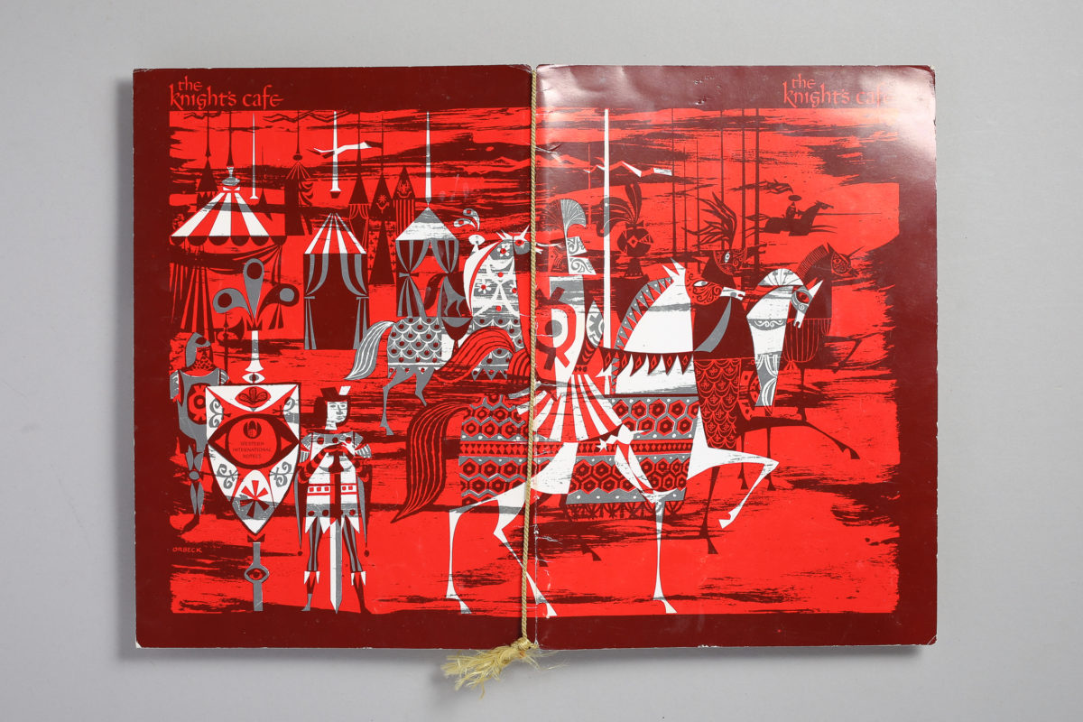
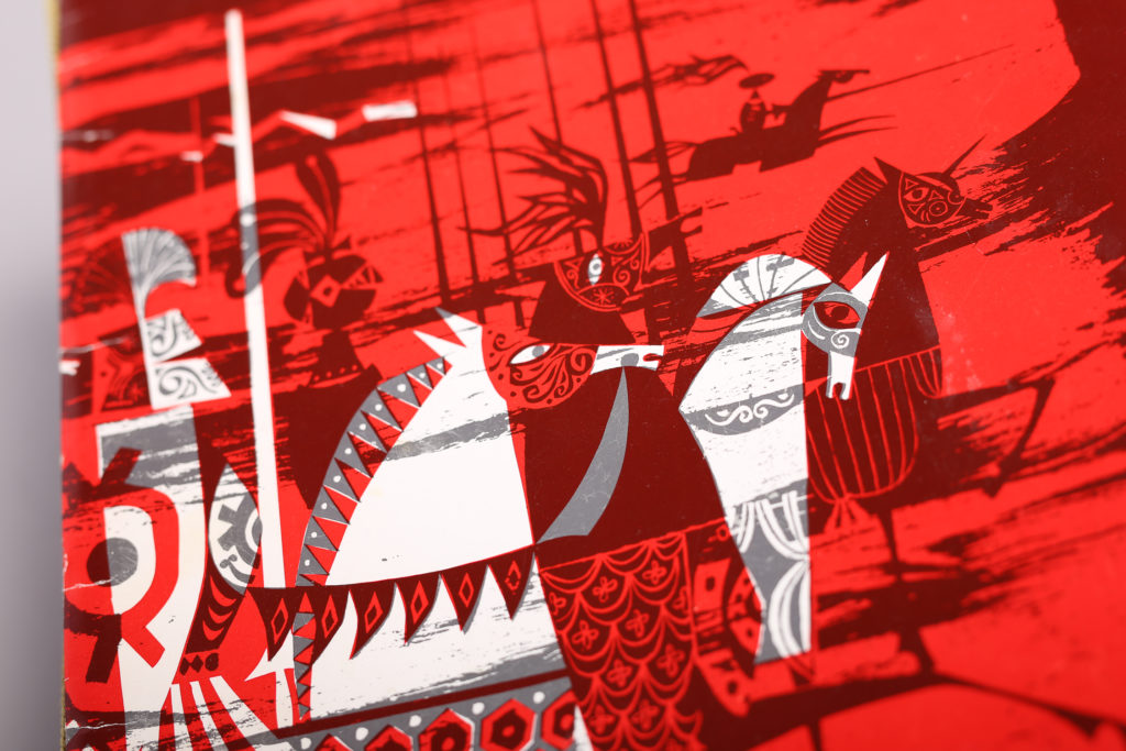
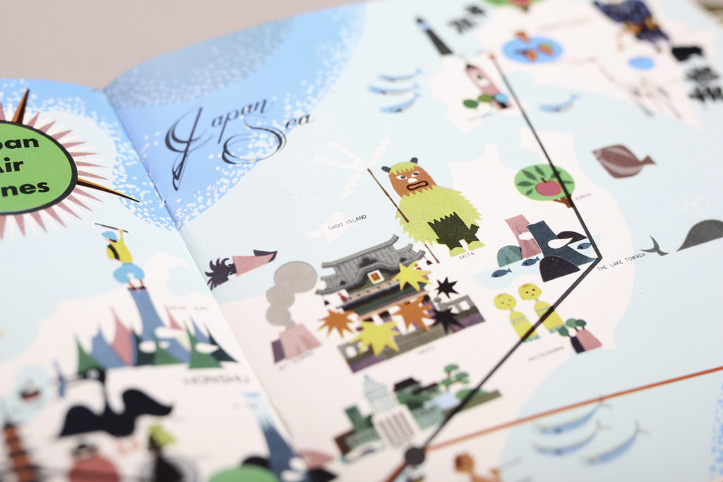
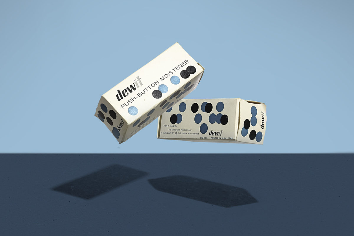
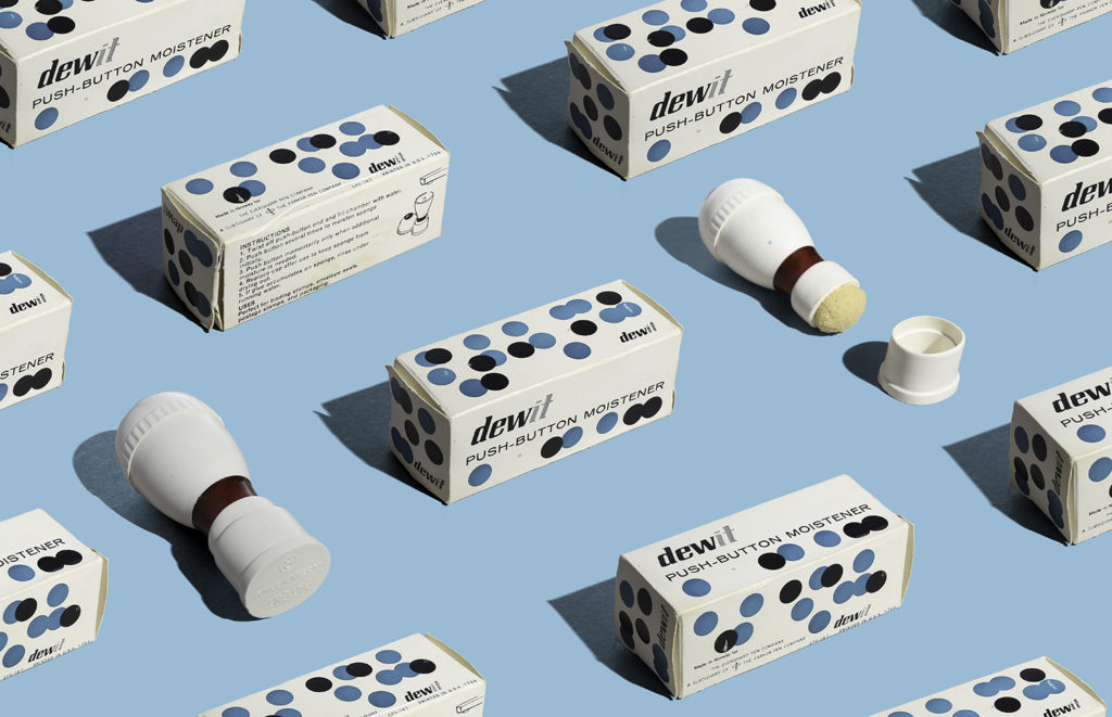
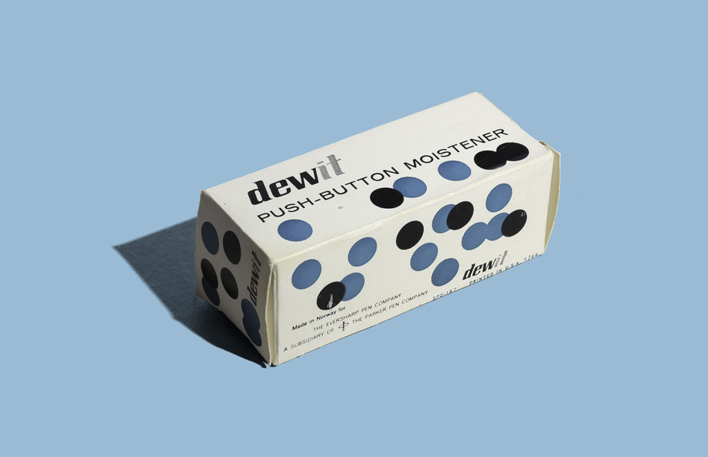
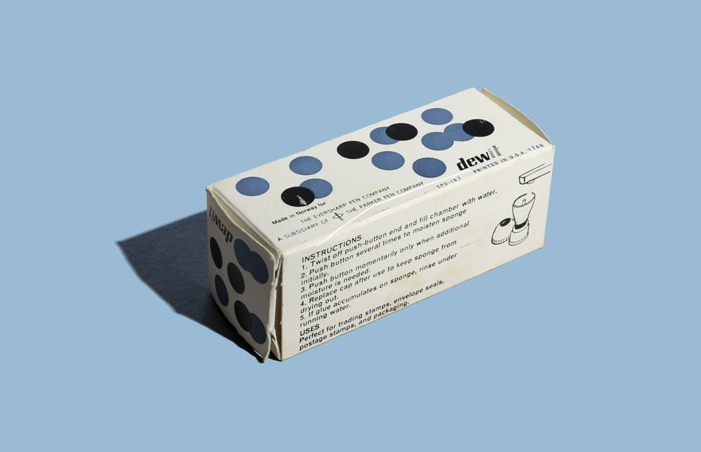
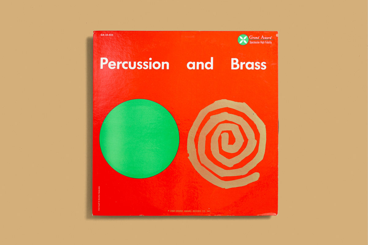
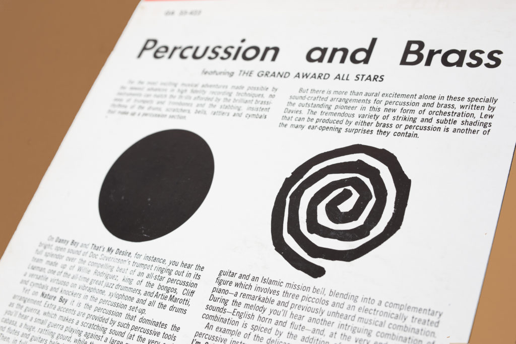
Here are a few records from his collection.

Cover design by Charles Murphy.
Cover design by S. Neil Fujita
Cover design by Josef Albers
Cover design by Saul Bass
Cover design by Rudolph de Harak

Herman Miller Brochures 1960

Here are four Herman Miller trifold brochures from 1960 featuring furniture and textiles by Ray and Charles Eames, George Nelson and Alexander Girard. I’ve had these in the ephemera archive for some time now. I’ve posted a snippet of them but I photographed the insides to show them as flat layouts. These were designed at George Nelson’s office and the designers involved were Irving Harper, Don Ervin, Tony Zamora and Dick Schiffer. Not sure which one is assigned to each of them but they work perfectly as a set and I just love the vibrancy of them. Again digital photos will never to this justice as they are way more vibrant in person and the use of overlays is hard to see digitally but here’s an attempt to document this in the blog. Enjoy!

The Knight’s Café Menu

Ok, if you know me, you know I am a sucker for medieval themes and for that reason this is one of my favorite things in the ephemera drawer. I picked this guy a while ago and I don’t know much about the illustrator besides it being signed “Orbeck”. The only other piece of ephemera I can track on the internet is this Vacation home design booklet posted by Victor Underhill and blogged at midcenturymodernist.com (the illustration style doesn’t match but who knows. this is also around the year I found this which dates back to ’08, seems so long ago but whatever…The illustrations are so good though, I love the horses. The simplicity of the geometric shapes is just phenomenal. As usual, our digital age can’t compare to the real deal, this menu features two colors with different varnishes and overprints that are hard to capture on camera but it adds a lot to the piece.

The menu design is from The Knight’s Café by the chef James Friswold. A restaurant by Western International Hotels. No year listed, only the day Wednesday April 21 but I did a fun experiment and found out that April 21st landed on a Wednesday on 1965 and based on the other post found from the 60’s I think it’s safe to say that’s it. So there you go, thanks Google. Enjoy!

Japan Airlines

Here’s a booklet for Japan Airlines Courier Route that shows well, you guessed it, routes and data such as travel distances and all that. Also a luggage sticker that I found inside the booklet. The booklet inside isn’t all that exciting other than a map in the middle but I thought the cover was nice but the thing that really caught my eye was the sticker. That bird was just too cool to leave behind.
There is no year but my guess is that this is from the 1960’s.

Dewit Push Button Moistener

Here’s a fantastic piece of packaging that has inspired me in things that are coming but that’s another story. I instantly gravitated towards the dots which in this case I can not see how this can conceptually relate to the product other than what the action of pushing a button looks like (but that a far stretch). What I love is that back then, packaging was more fun because there weren’t that many established rules, standards and factors to packaging as there are now (unfortunately). But this makes such a boring product look fun and I’m sure it stood out on shelf.

This product was made in Norway for The Eversharp Pen Comapany, a subsidiary of The Parker Pen Company. Printed in USA 1966. I wonder if the packaging was designed in Norway.

Percusions and Brass

Here’s a record cover designed by Chermayeff & Geismar Associates titled Percusions and Brass and put out by the Grand Award record label. It was really sad to find out a couple years that one of the great masters of graphic design, Ivan Chermayeff passed away in December 2017. I wanted to post this in his honor but unfortunately the blog was on hiatus and I couldn’t access it then. Nevertheless here is one of my favorite record covers from my collection. Such an iconic modernist piece. It’s hard to see on the picture but the spiral shape is actually printed in metallic gold. Record Cover circa 1960.