Household Gloves Fuller Packaging

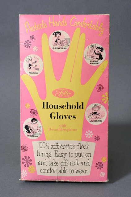
Here’s a fun packaging for household gloves made by Fuller Brush Co. It has some fun illustrations of ladies cleaning the house which of course wouldn’t fly with today’s standards but hey the illustrations are nice. The flowers, the glove and the type made me pick up this example of Mid Century Packaging geared towards the fine women of that era. There is no date but I’d say this is from the 1950’s. Enjoy!

Design: Unknown  |  Year: 1950?  |  Photo: Javier Garcia

Paul Rand and Alvin Lustig Collab

Here’s an interesting book cover designed by Paul Rand. The interesting thing about this is that Alvin Lustig hired Rand to design this cover  while the interior design and typography was done by Alvin Lustig. This brings two great designers together. Such a fun and modern cover. Enjoy!

Design: Paul Rand   |   Year: 1953   |   Photo: Javier Garcia

Sweetheart Sparkles Straws Packaging circa 1950’s

Here’s a fun packaging for Sweetheart Sparkles Straws made by Divisions of Maryland Cup Corporation. They are colorful transparent dinking straws that display nicely through the die cut window in the shape of a cup. I really like how they arranged the type in the stem of the cup. There’s no date on this thing but the type and shapes totally scream 1950’s. Enjoy!

Design: Unknown    |    Year: 1950’s?     |   Photo: Javier Garcia

Table Tennis packaging by Milt Herder

Here’s a fun packaging designed by Milt Herder for Pressman Toy Corp, New York. The colors, the thick type and the hand drawn faces makes this piece so much fun. Because of the graphics and because the company went through a name change in 1942, I’m going to date this to the late 40’s.The box was in such bad shape but I still thought it was worth showing. Enjoy!

Design: Milt Herder  |  Year: 1940’s?   |  Photo: Javier García

Blair Spray-Fix Packaging circa 1949

Here’s a funky packaging for Blair Art Products from Memphis Tennessee. It’s a low odor spray fixative with a very lighthearted and fun feel. I wish their products looked less serious as they look today, specially for products with artist as their main target audience. Anyway, really love the funky illustrations on the front and back, although the front guy looks like he’s enjoying the smell of it quite too much. Beautiful script type on the front as well. I’m going to take a wild guess and date this to the late 40’s based on this little history page which states spray fixatives were introduced in 1949. Enjoy!

Design: Unknown  |  Year: 1949  |  Photo: Javier Garcia

Columbia Masterworks Book cover by Alex Steinweiss

Here is a book cover designed by Alex Steinweiss titled “The Columbia Book of Musical Masterworks” in 1947. I normally think record covers when I think of Steinweiss so when I saw this book, I snagged it right away. As usual there is a nice play with type, image and texture. Enjoy!

Design: Alex Steinweiss   |   Year: 1947   |   Photo: Javier Garcia