It’s My Beer

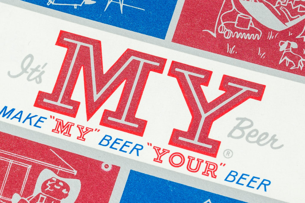
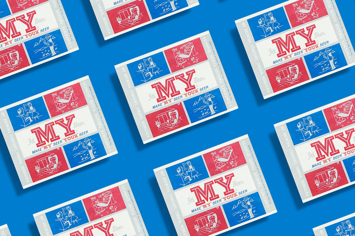
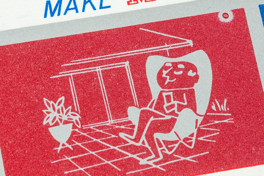
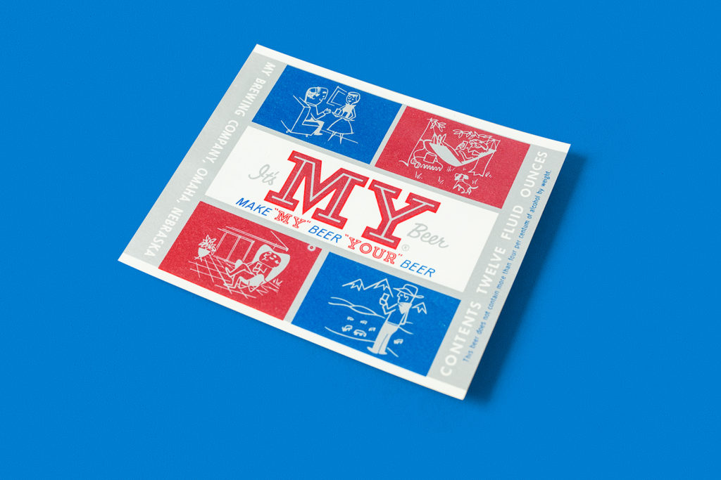
Here’s a fantastic whimsical beer label for My Brewing Company in Omaha, Nebraska. The beer is called “It’s my beer. Very unusual compared to most serious looking labels of the time. It features four illustration settings, my favorite being the bottom left with the dude sitting on a Butterfly chair with a bullet planter (Someone was into modernism). The type was very fitting to the illustrations as well with featuring common typeface choices of the era with the inline type, the sans serif and the script. The name is also very unusual (and hard to research). If you know more about this beer let us know. I’ve seen the can version of this but I was lucky to find an unused label. The colors don’t show well in the photos but they are metallic. Enjoy!
La Fonda Del Sol Menu

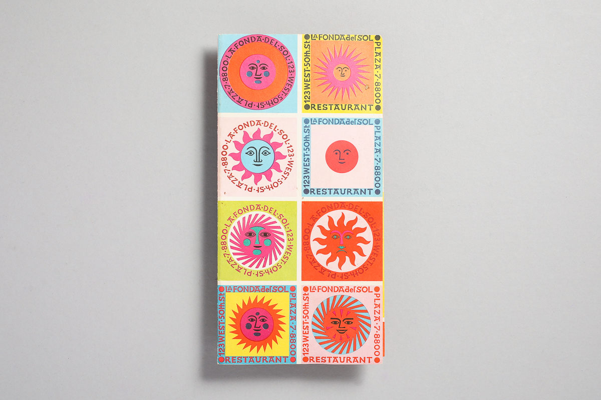
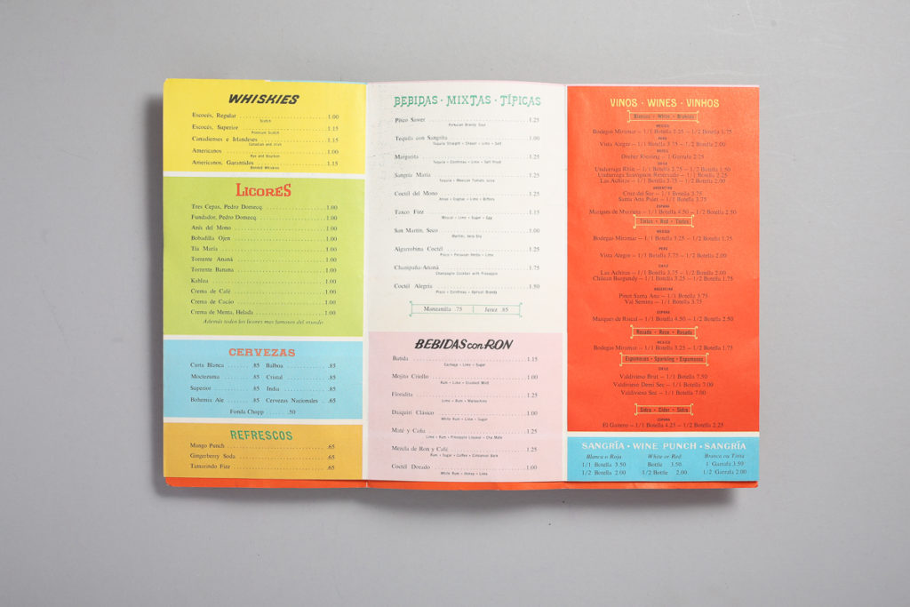
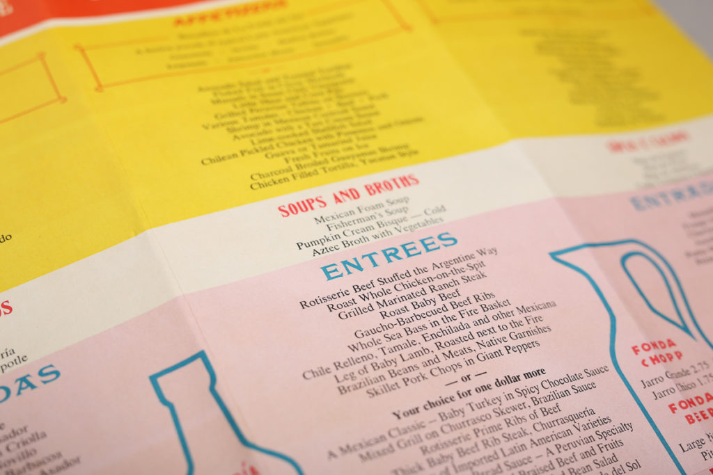
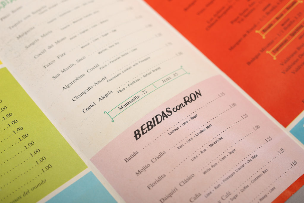
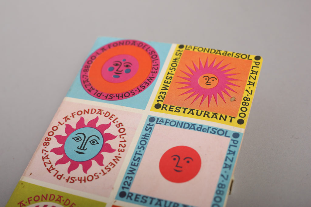
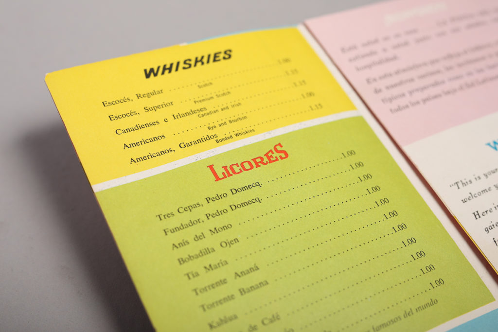
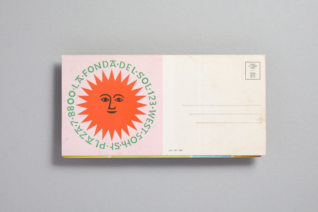
I thought I would start with something classic and what a better way to do it than with the great master and acclaimed designer Alexander Girard. This is a Dinner Menu Design for La Fonda del Sol Restaurant in New York circa 1960. It is an offset lithograph with wonderful vibrant colors. I can almost say the work done for this restaurant (specially the suns) are one of his most celebrated and recognized designs. This menu has also been featured in many museums such as the SFMOMA. So here are some closeups of the type and full shots of the menu. Enjoy!

Consumer Reports Bill Charmatz, Roy Doty

Not too long ago, I found this great stack of magazines contained in three binders. I was in a rush but quickly flipped through a few and took one binder. After seeing what was inside, I had to go back and get the others.

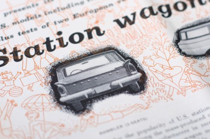
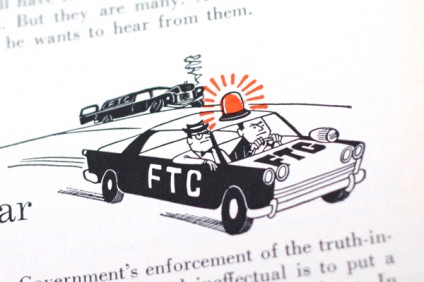
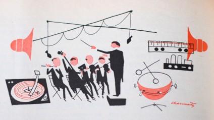
Well, what we have here are some Consumer Reports magazines from late 50’s through 60’s mostly illustrated by Bill Charmatz (1945-2005) and Roy Doty (I believe he’s still illustrating). Both prolific during the 50s and 60s and continued through today (although their styles evolved). There are a few other unsigned illustrations in a few issues that I wasn’t able to identify. I was able to spot Doty and Charmatz because they signed some of their illustrations. Thanks to Scott Lindberg from (New Doccuments) for stepping in to identify Charmatz’s signature for me. Click images to enlarge.

Way too much to show. Enjoy!

Design: Bill Charmatz, Roy Doty, etc.   |   Year: 1950-60   |   Photo: Javier García

More images after the jump…

Continue reading “Consumer Reports Bill Charmatz, Roy Doty”

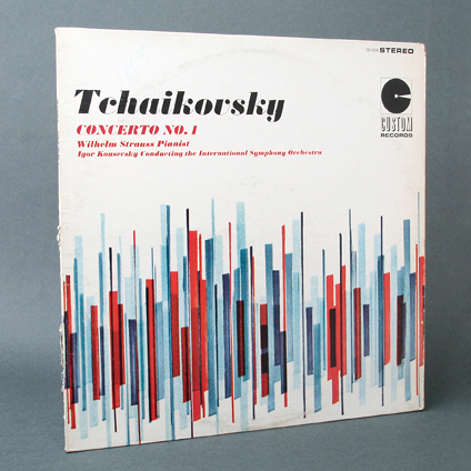
Tchaikovsky Concerto No. 1

Record cover for Tchaikovsky. Concerto No. 1. Wilhelm Strauss, Pianist. Igor Kousevsky, Conducting the International Symphony Orchestra.

Those bars look like an equalizer. Makes it feel like the music itself.

Design: Unknown  |  Year: Unknown  |  Photos: Javier García

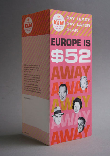
Europe is $52 Away!

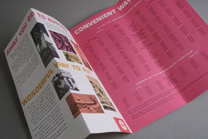
Vintage KLM Royal Dutch Airlines Pamphlet. Designer Unknown. I like the colors, very 60’s. Reminds me of Alexander Girard’s color schemes. Love the use of Eurostile and the cut out faces. Looks 500 times better in person.

Design: Unknown  |  Year: 1962  |  Photos: Javier García

More images after the jump…

Continue reading “Europe is $52 Away!”

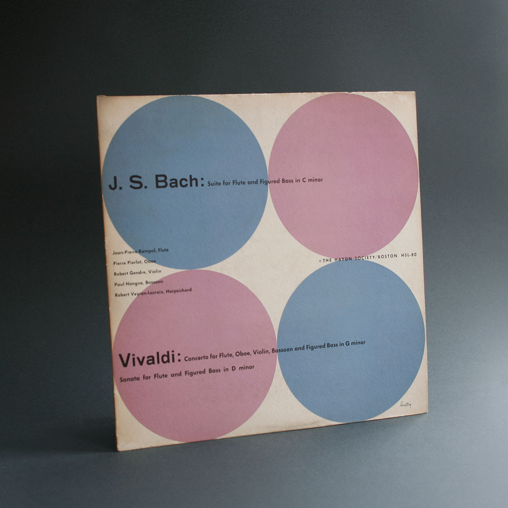
Alvin Lustig Bach Vivaldi

lustig_bach_2

lustig_bach_3

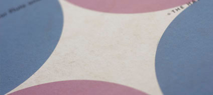
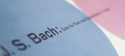
Here’s another Haydn Society record from my all time favorite, Alvin Lustig. This cover is very simple yet very different from the others. The circles make it look very modern and minimal while at the same time it helps reiterate the two composers distinction by changing its color.

Hope you all enjoy this as much as I do and stay tuned for more…

Designer: Alvin Lustig   |   Year: ?   |   Photos: Javier García