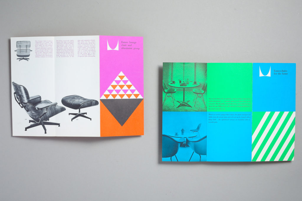
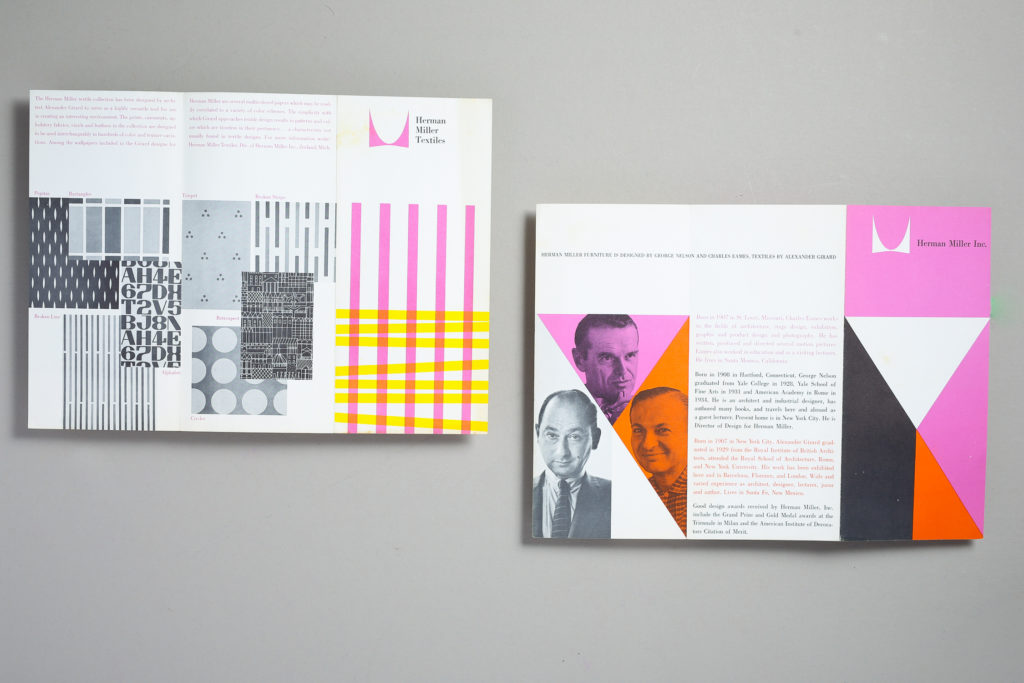
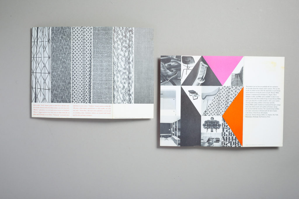
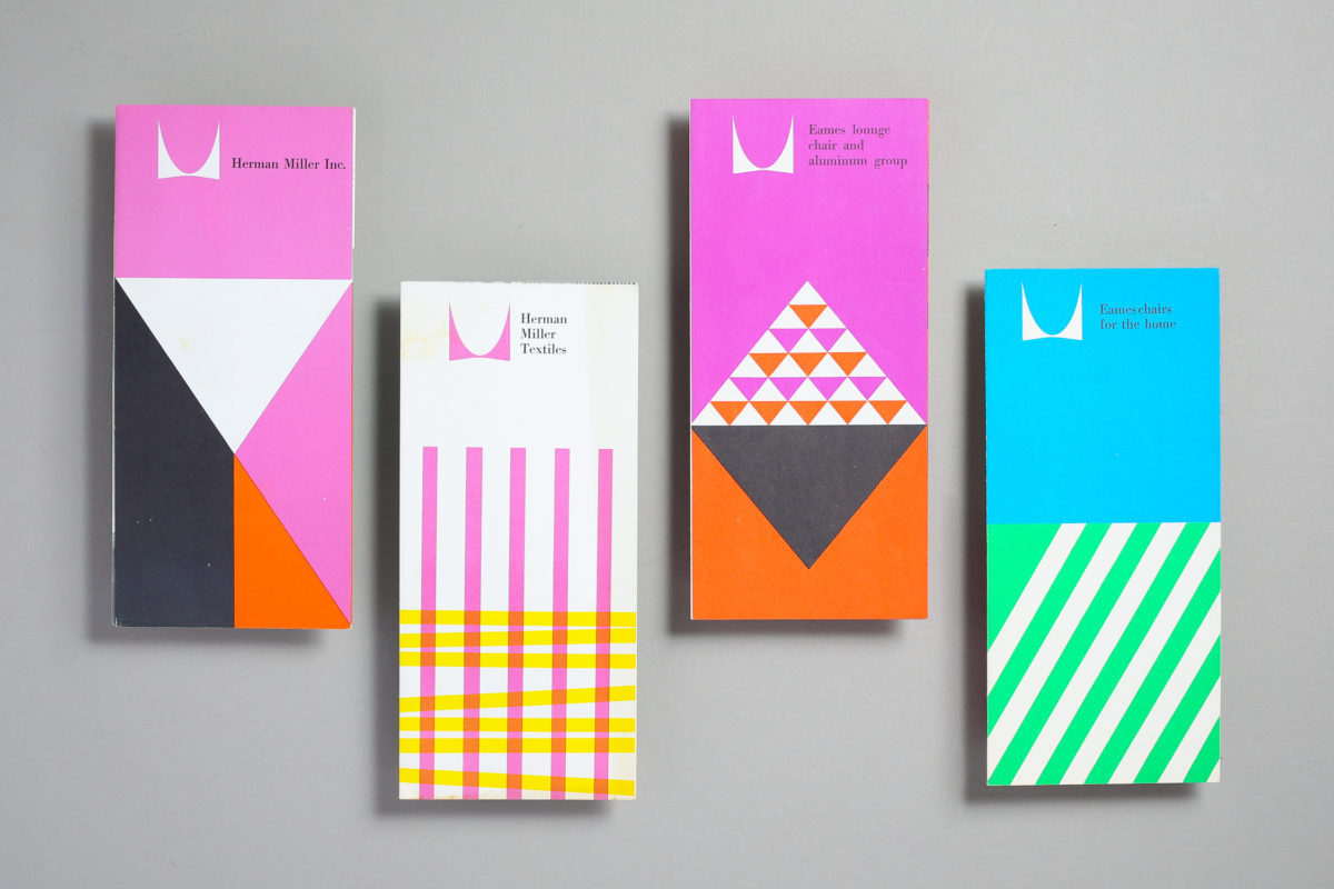
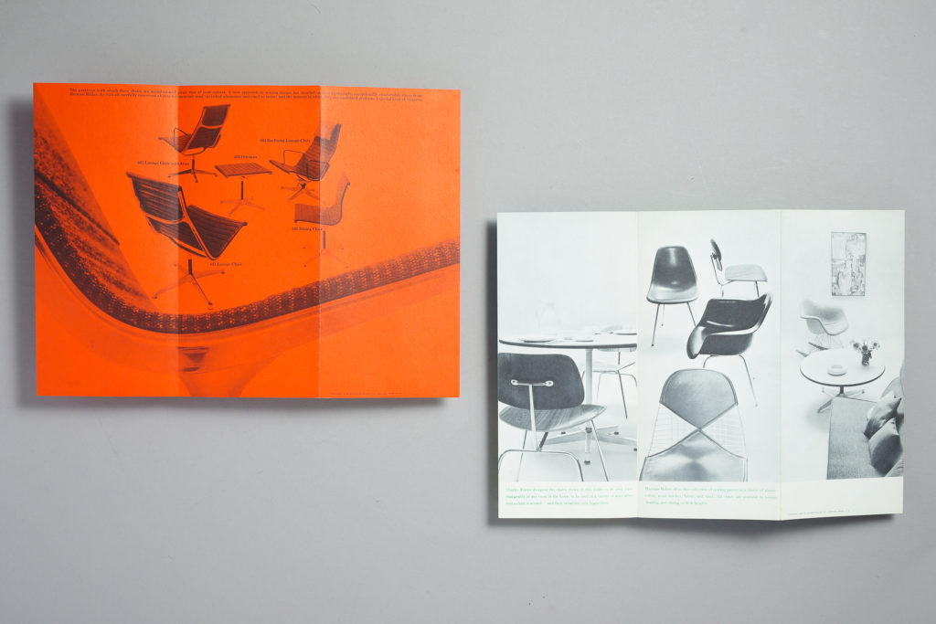
Here are four Herman Miller trifold brochures from 1960 featuring furniture and textiles by Ray and Charles Eames, George Nelson and Alexander Girard. I’ve had these in the ephemera archive for some time now. I’ve posted a snippet of them but I photographed the insides to show them as flat layouts. These were designed at George Nelson’s office and the designers involved were Irving Harper, Don Ervin, Tony Zamora and Dick Schiffer. Not sure which one is assigned to each of them but they work perfectly as a set and I just love the vibrancy of them. Again digital photos will never to this justice as they are way more vibrant in person and the use of overlays is hard to see digitally but here’s an attempt to document this in the blog. Enjoy!
Category: Graphic Design
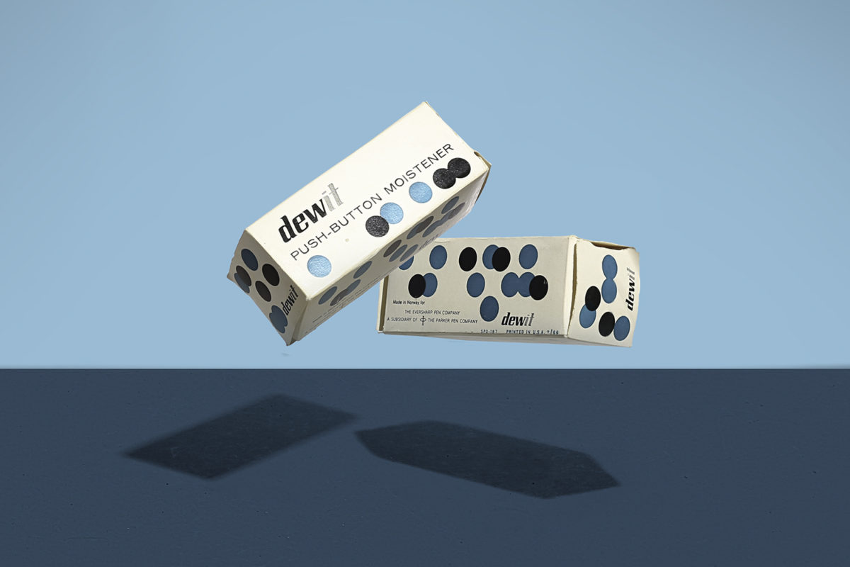
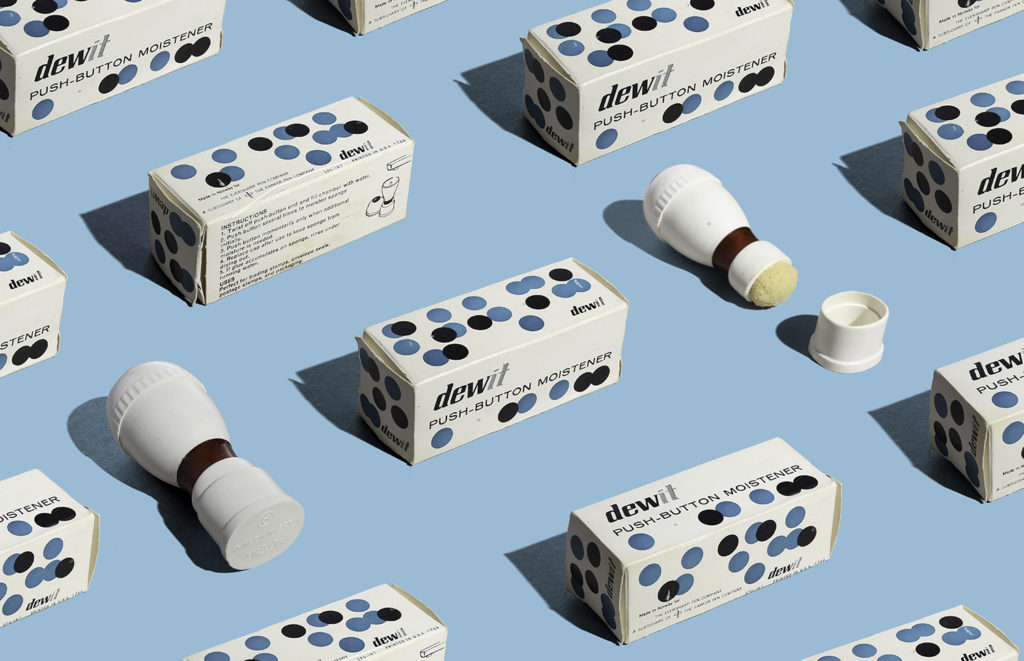
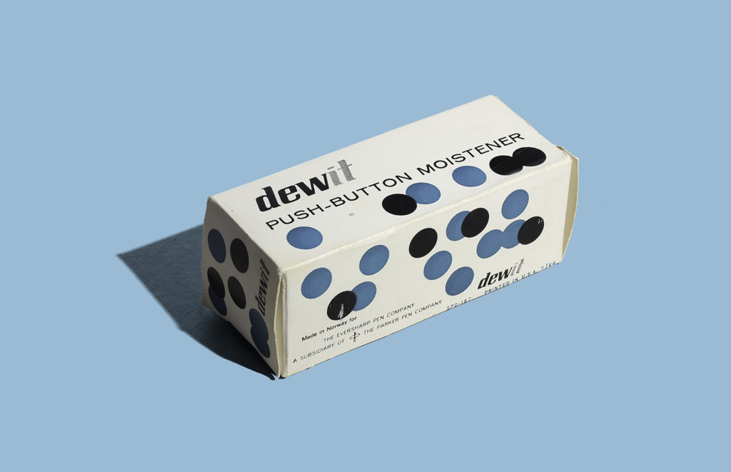
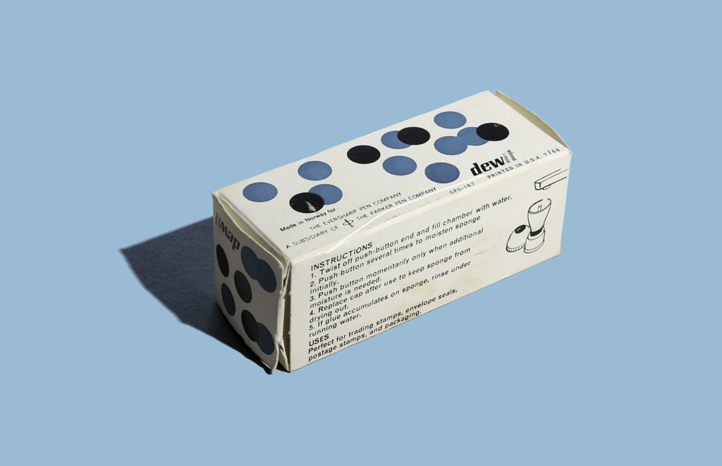
Dewit Push Button Moistener
Here’s a fantastic piece of packaging that has inspired me in things that are coming but that’s another story. I instantly gravitated towards the dots which in this case I can not see how this can conceptually relate to the product other than what the action of pushing a button looks like (but that a far stretch). What I love is that back then, packaging was more fun because there weren’t that many established rules, standards and factors to packaging as there are now (unfortunately). But this makes such a boring product look fun and I’m sure it stood out on shelf.
This product was made in Norway for The Eversharp Pen Comapany, a subsidiary of The Parker Pen Company. Printed in USA 1966. I wonder if the packaging was designed in Norway.
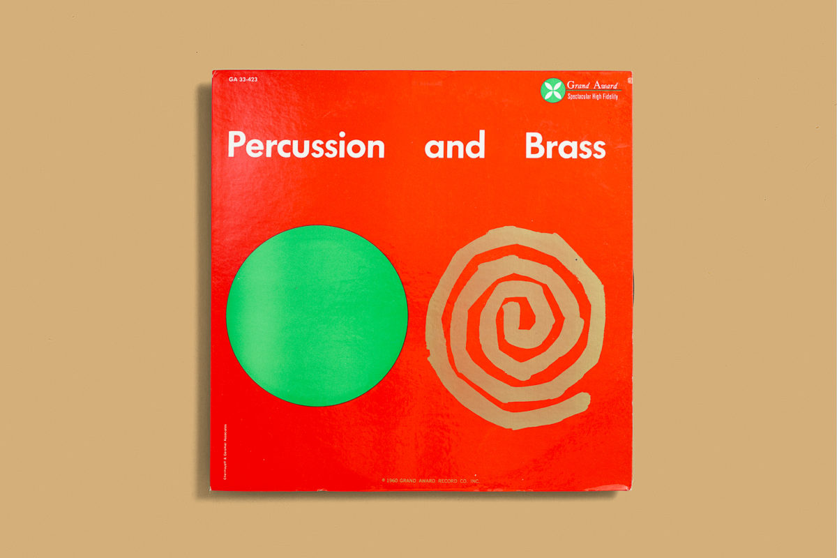
Percusions and Brass
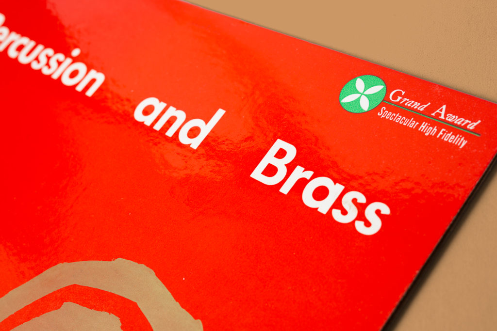
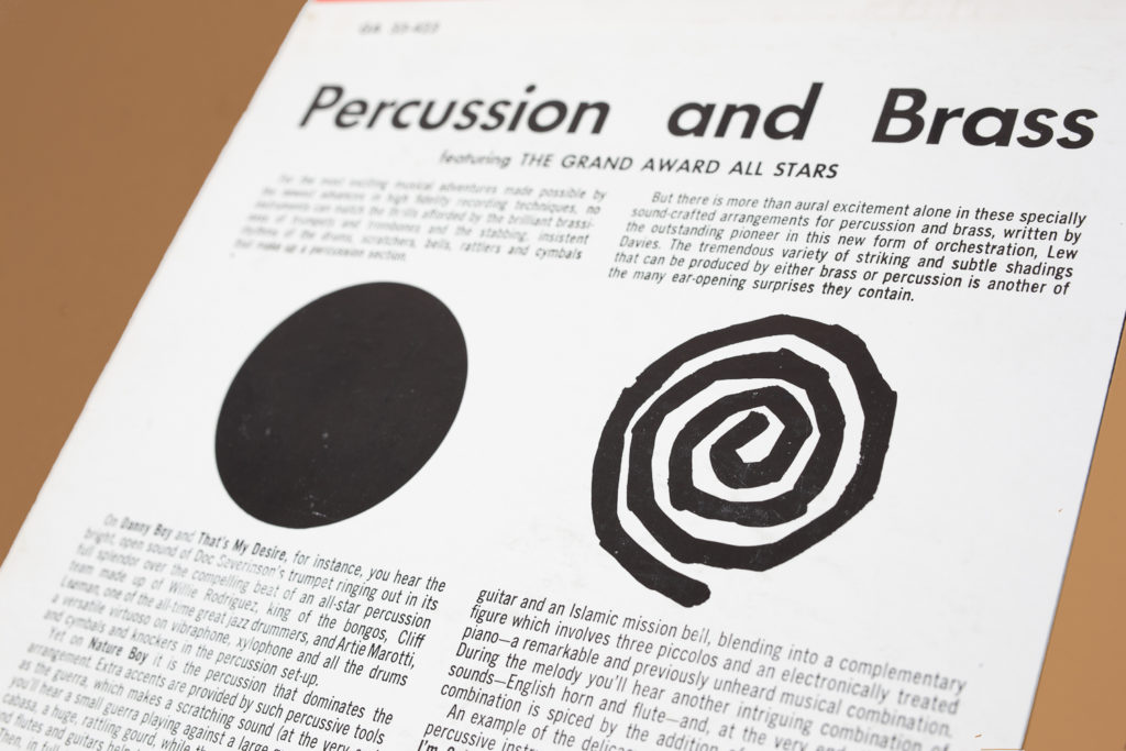
Here’s a record cover designed by Chermayeff & Geismar Associates titled Percusions and Brass and put out by the Grand Award record label. It was really sad to find out a couple years that one of the great masters of graphic design, Ivan Chermayeff passed away in December 2017. I wanted to post this in his honor but unfortunately the blog was on hiatus and I couldn’t access it then. Nevertheless here is one of my favorite record covers from my collection. Such an iconic modernist piece. It’s hard to see on the picture but the spiral shape is actually printed in metallic gold. Record Cover circa 1960.
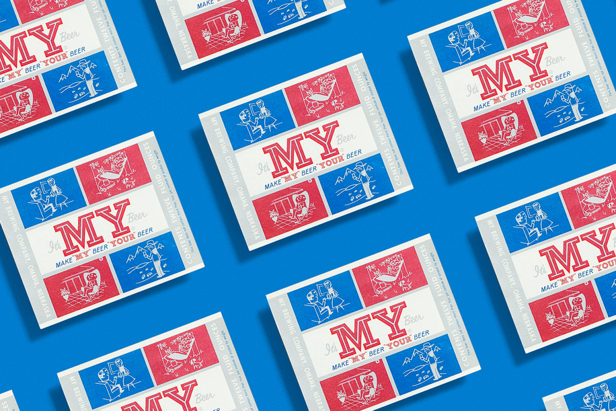
It’s My Beer
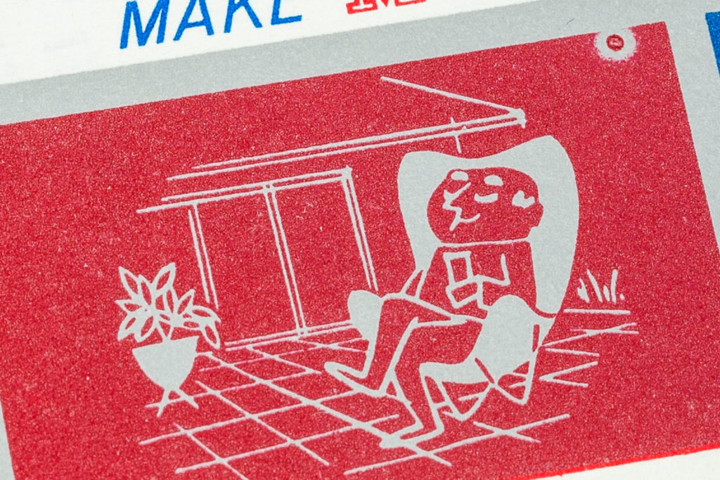
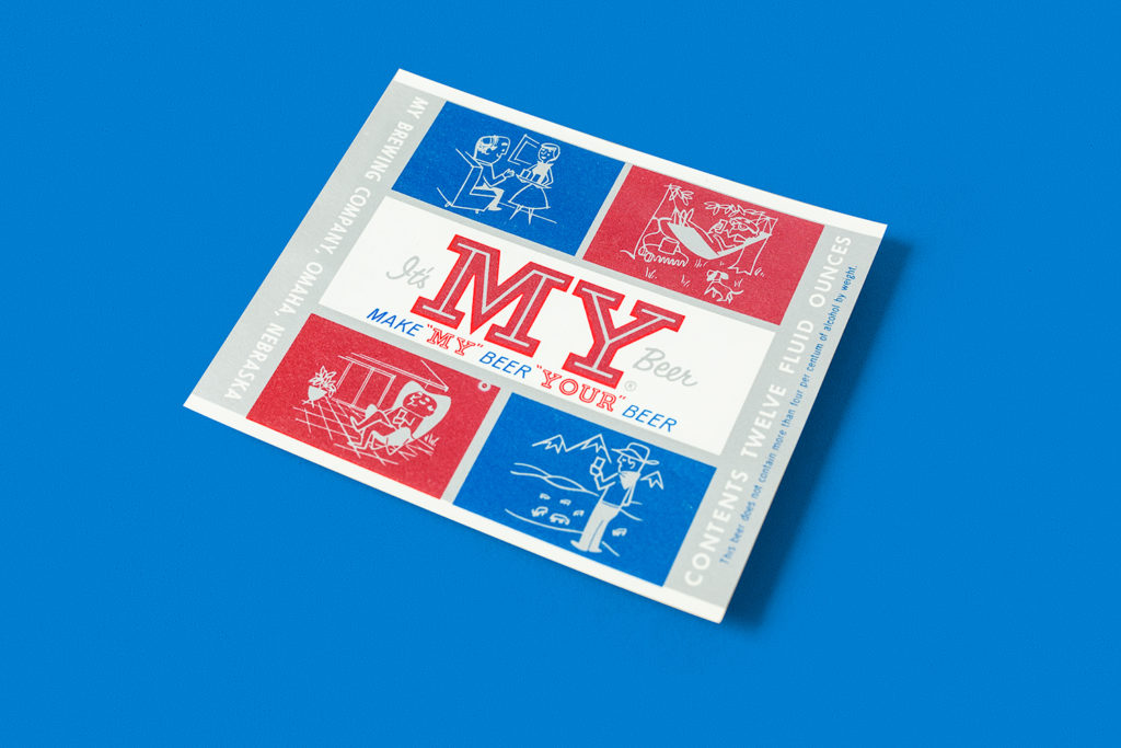
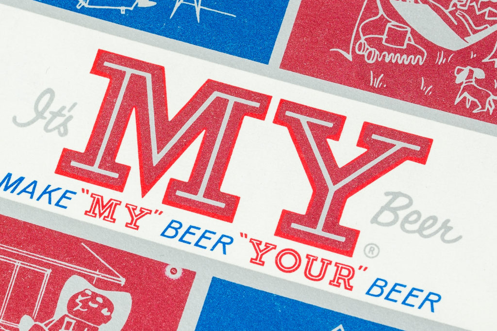
Here’s a fantastic whimsical beer label for My Brewing Company in Omaha, Nebraska. The beer is called “It’s my beer. Very unusual compared to most serious looking labels of the time. It features four illustration settings, my favorite being the bottom left with the dude sitting on a Butterfly chair with a bullet planter (Someone was into modernism). The type was very fitting to the illustrations as well with featuring common typeface choices of the era with the inline type, the sans serif and the script. The name is also very unusual (and hard to research). If you know more about this beer let us know. I’ve seen the can version of this but I was lucky to find an unused label. The colors don’t show well in the photos but they are metallic. Enjoy!
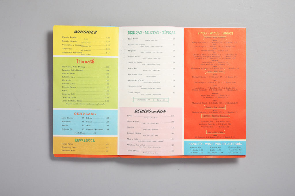
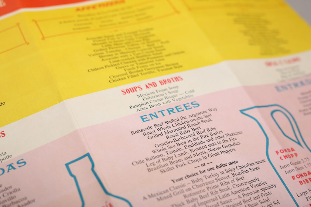
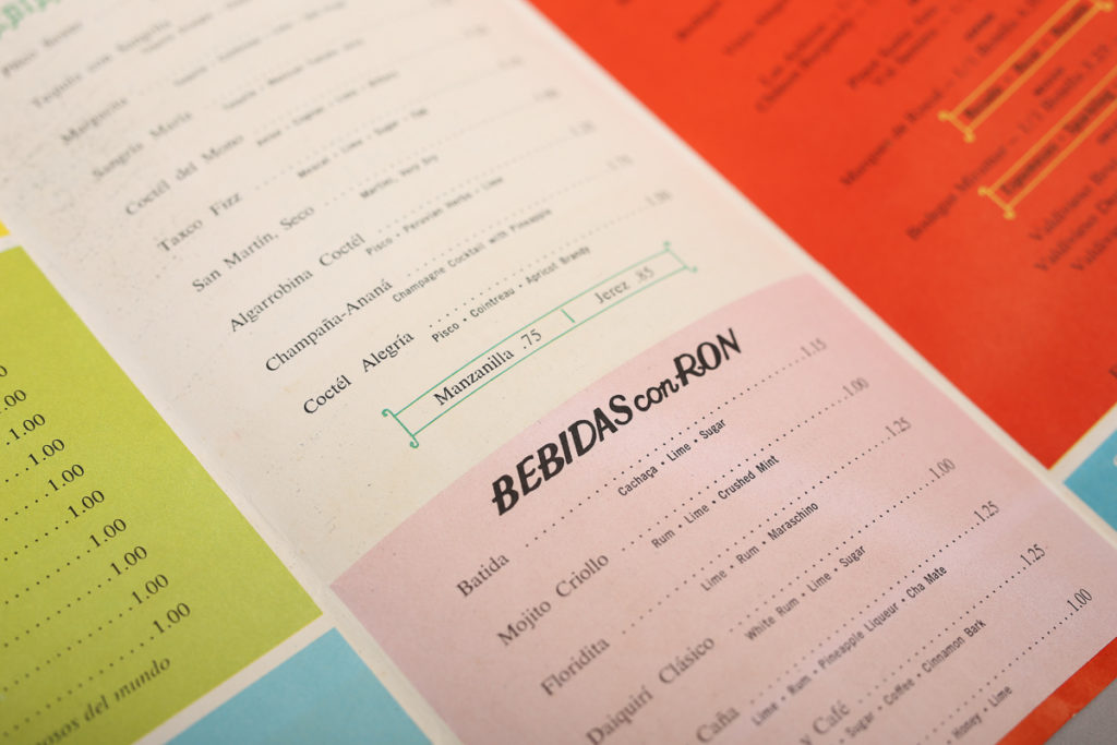
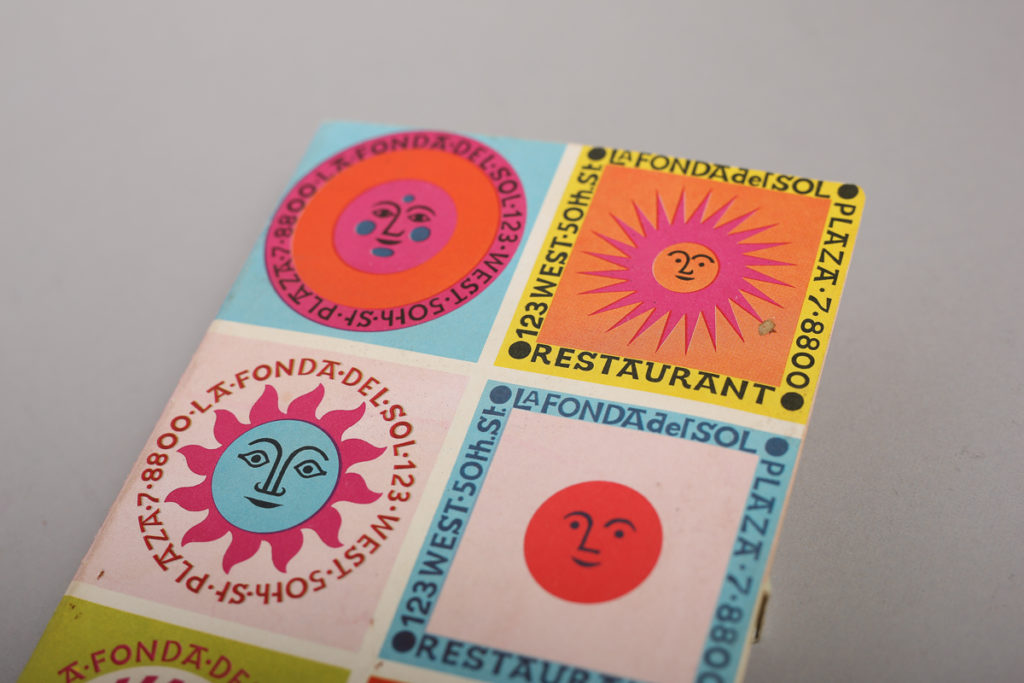
La Fonda Del Sol Menu
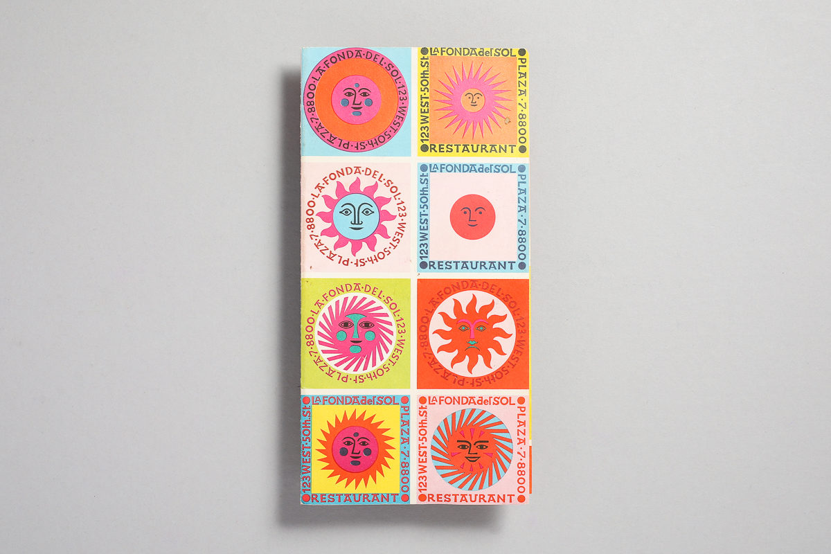
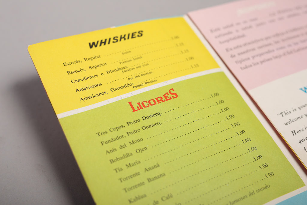
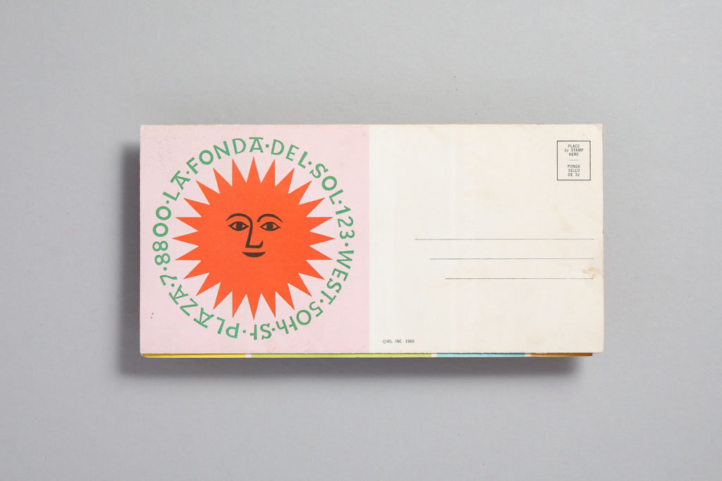
I thought I would start with something classic and what a better way to do it than with the great master and acclaimed designer Alexander Girard. This is a Dinner Menu Design for La Fonda del Sol Restaurant in New York circa 1960. It is an offset lithograph with wonderful vibrant colors. I can almost say the work done for this restaurant (specially the suns) are one of his most celebrated and recognized designs. This menu has also been featured in many museums such as the SFMOMA. So here are some closeups of the type and full shots of the menu. Enjoy!
It’s Back
After a long hiatus (and pressure from a few of you), I’ve decided to take another stab at picking this up where I left it. There’s still some cool stuff to share and hopefully someone will dig it. So come back and check hopefully every week or so for new posts. Peace!