Mexican Logos & Symbols


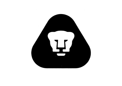
Pumas (UNAM) 1974 – Design: Manuel “Pajarito” Andrade

It’s been a while since I posted logos and I was recently digging to find some information about some of my favorite ones from México. Here are a few, some of them are no longer in use, my favorite being the top one (Pumas). The last three logos were designed by the great Lance Wyman for companies in México. Enjoy!


Artes de México (500 Años del encuentro) 1992 – Design: Luis Almeida y Ricardo Real
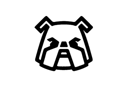

Apasco 1975 – Design: Pedro Ramírez Vázquez

Pemex 1981 – Design: Harte Reinking y Asociados

La Buena Señal, ca 1965 – Design: Eduardo Téllez

Comercial Mexicana – Design: Fernando Rión

Lili-Ledy – Design: Lance Wyman
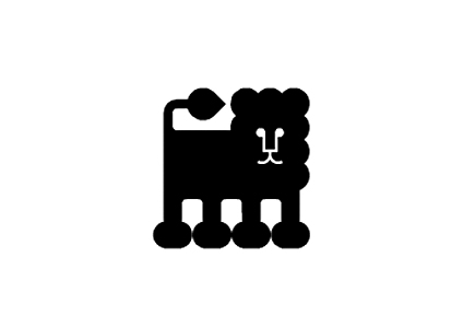

Red Lion Restaurant / Disco – Design: Lance Wyman
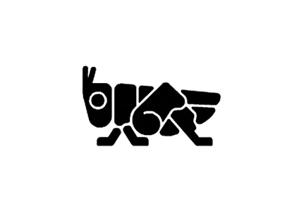

Hotel Presidente Chapultepec – Design: Lance Wyman

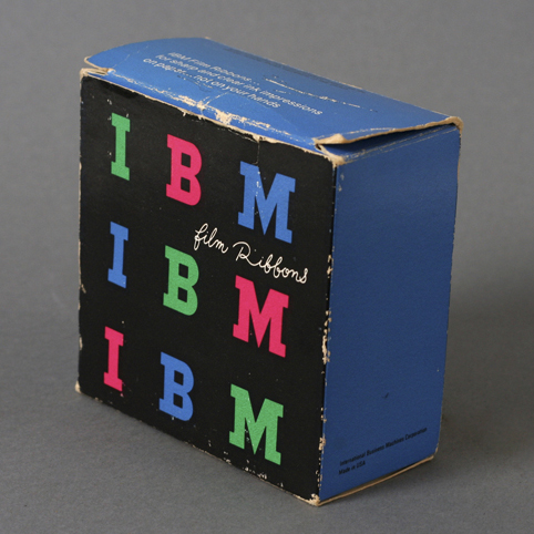
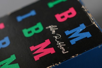
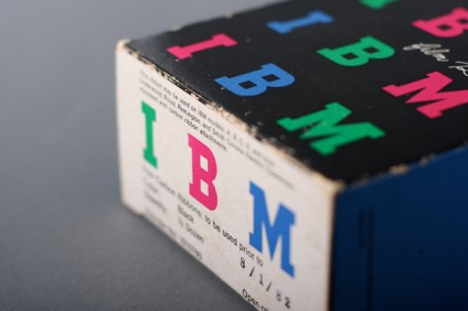
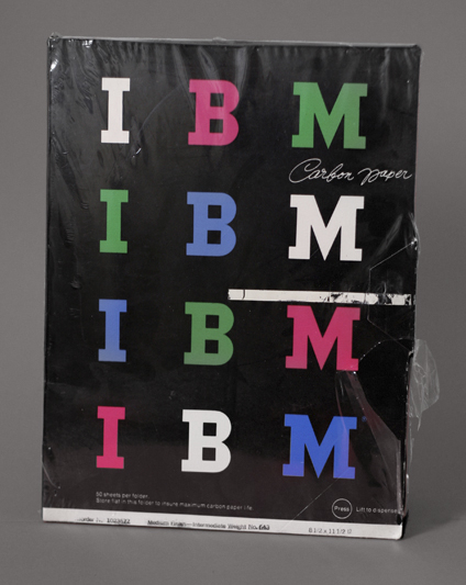
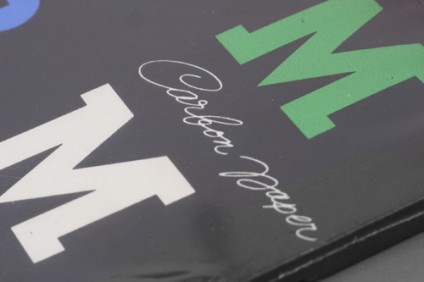
IBM Packaging by Paul Rand

You can never go wrong with Paul Rand. Here’s a beautiful colorful example of IBM’s packaging for Film Ribbons and Carbon Paper. Love the contrast of the handwritten font against the bold IMB type. Oddly enough, I found the carbon paper mingling through my dad’s office one day. Still wrapped. Enjoy!

Update: Typedeck did some search and dated this product to mid 60’s. Thanks Typedeck!

Design: Paul Rand  |  Year: Mid 1960’s  |  Photo: Javier García

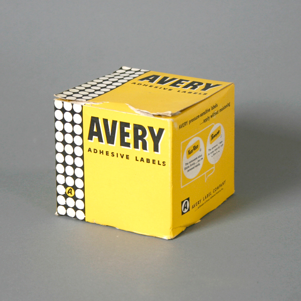
Avery Adhesive Labels Packaging

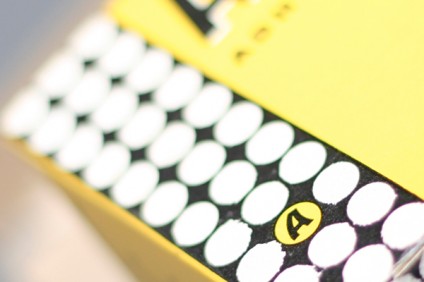
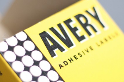
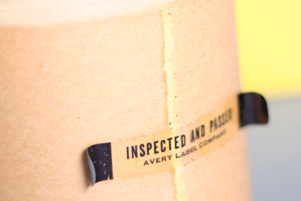
I haven’t featured packaging in a while so here’s a fun one. It’s for Avery Label Company. I love the white space, solid colors, bold type and that bar of circles on the left is ace. The designer and year is unknown but I do know that the Avery logo was beautifully redesigned by the great Saul Bass in 1990 so from the printing I and aging I can see on this piece, I’d say it’s from the 60’s but that’s just my guess. In any case, I hope you enjoy this post!

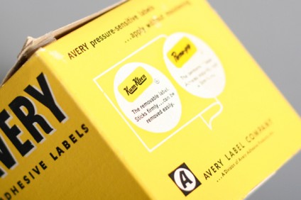
Fun fact: there’s a logo on the back that reminds me of the Krispy Kreme logo but it says Kum-Kleen, does that sound weird?

View more packaging posts »

Design: Unknown | Year: Unknown | Photo: Javier Garcia