Herman Miller Brochures 1960

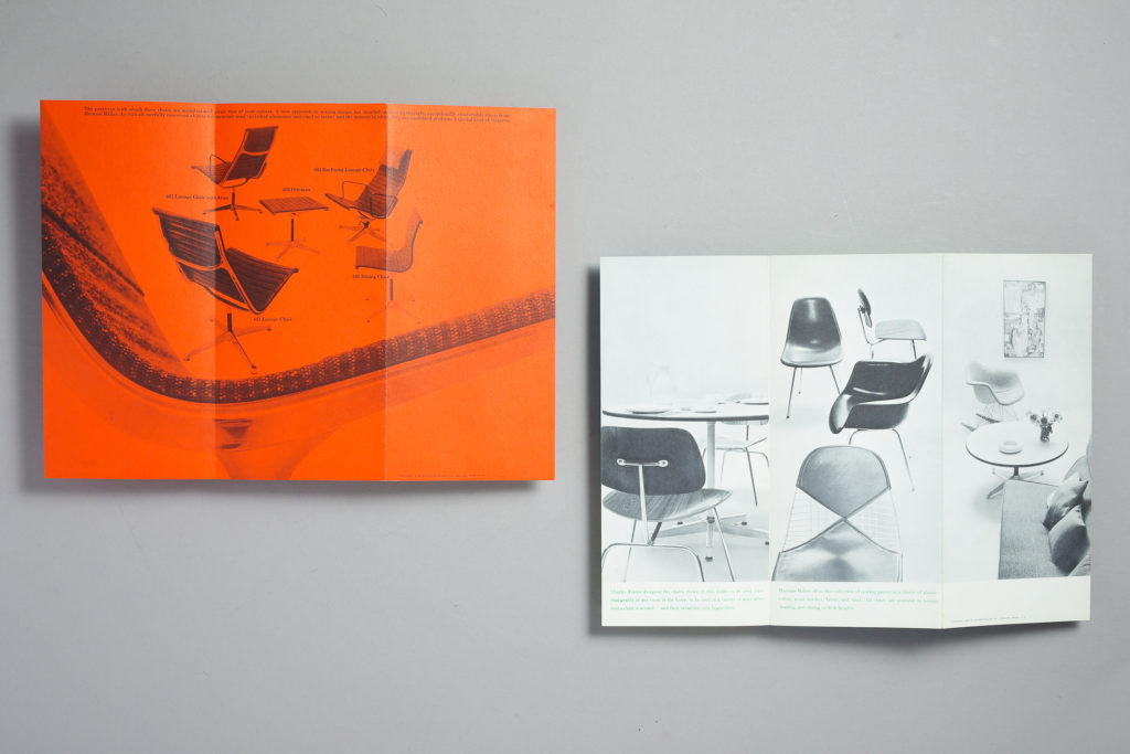
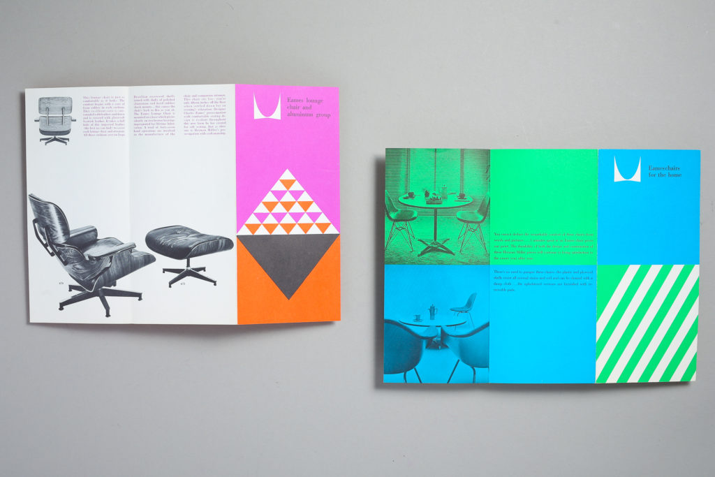
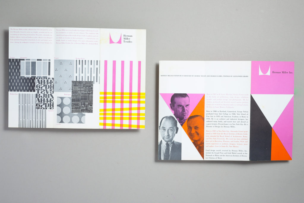
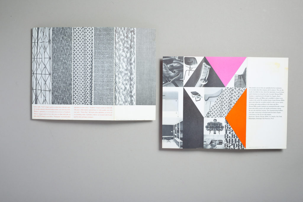
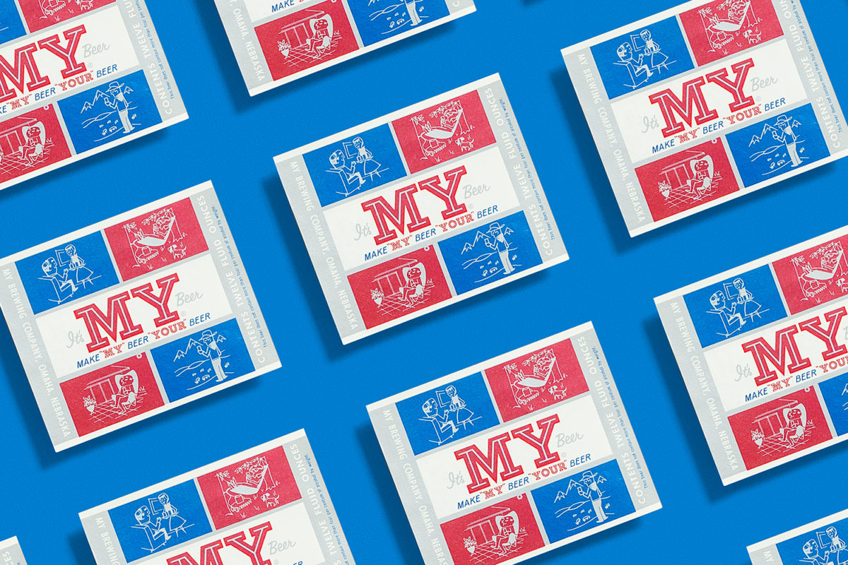
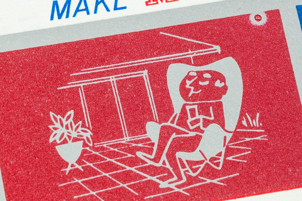
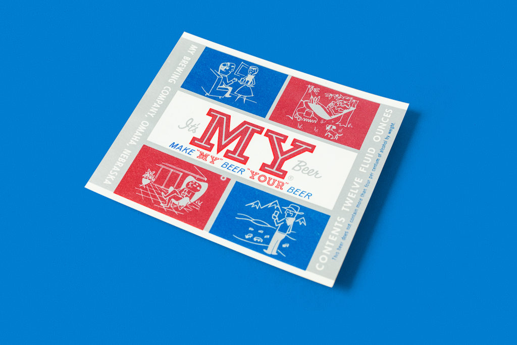
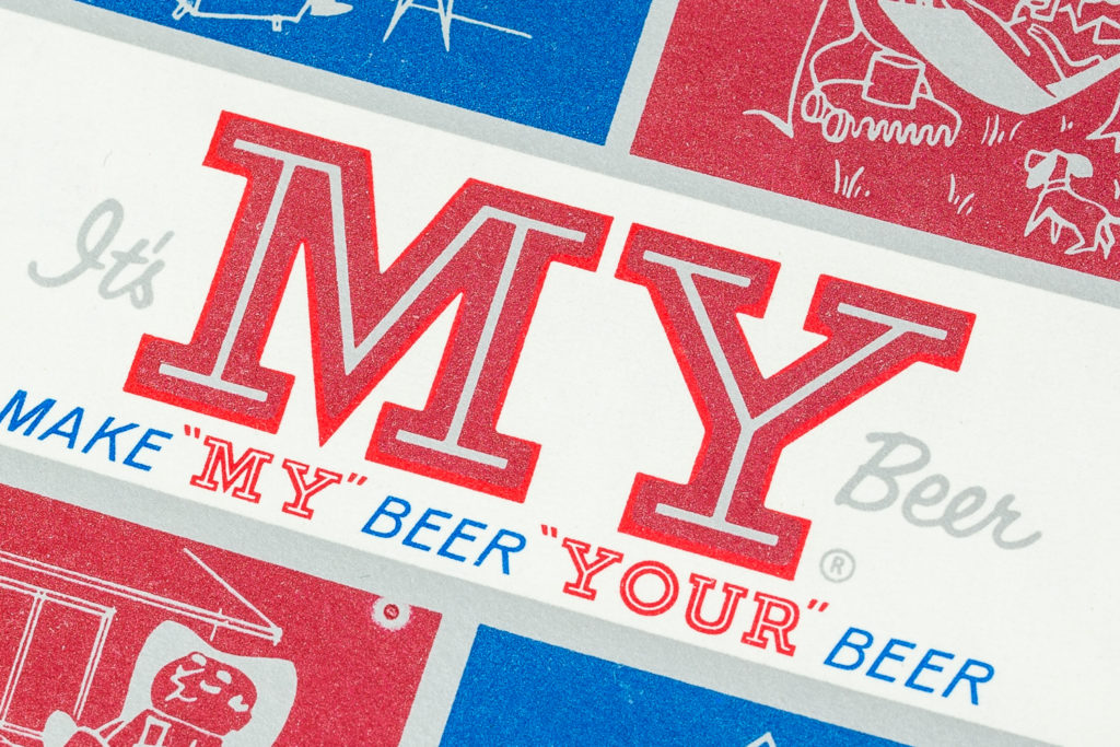
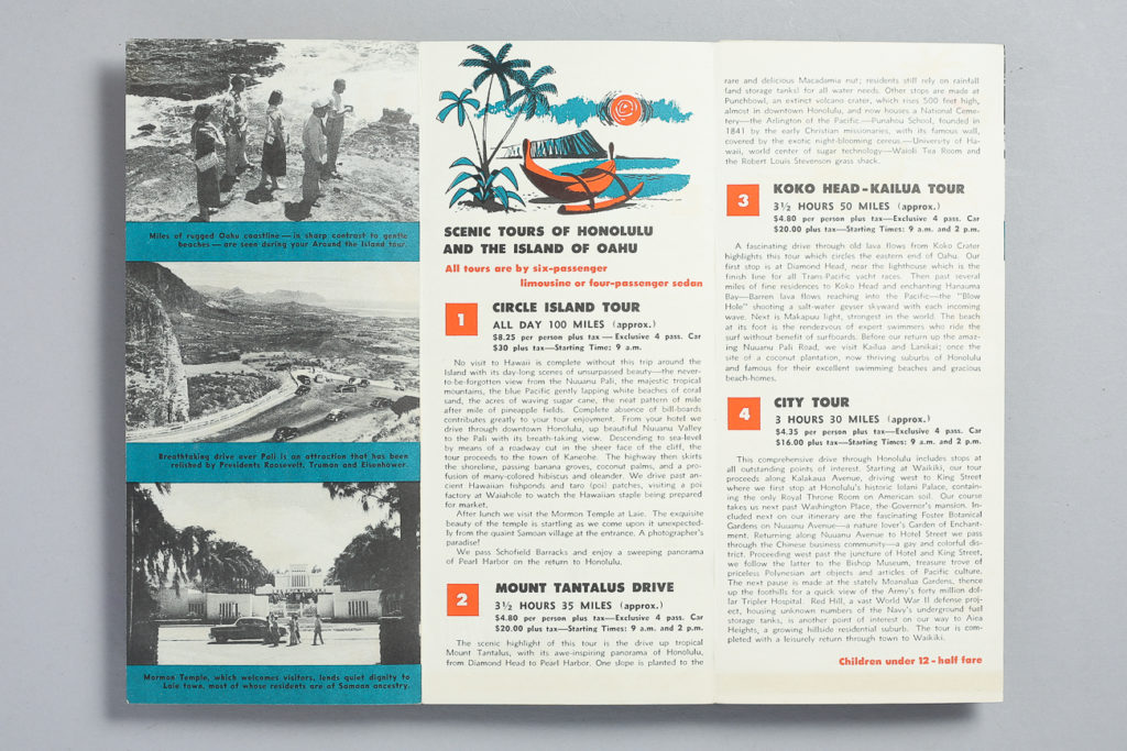
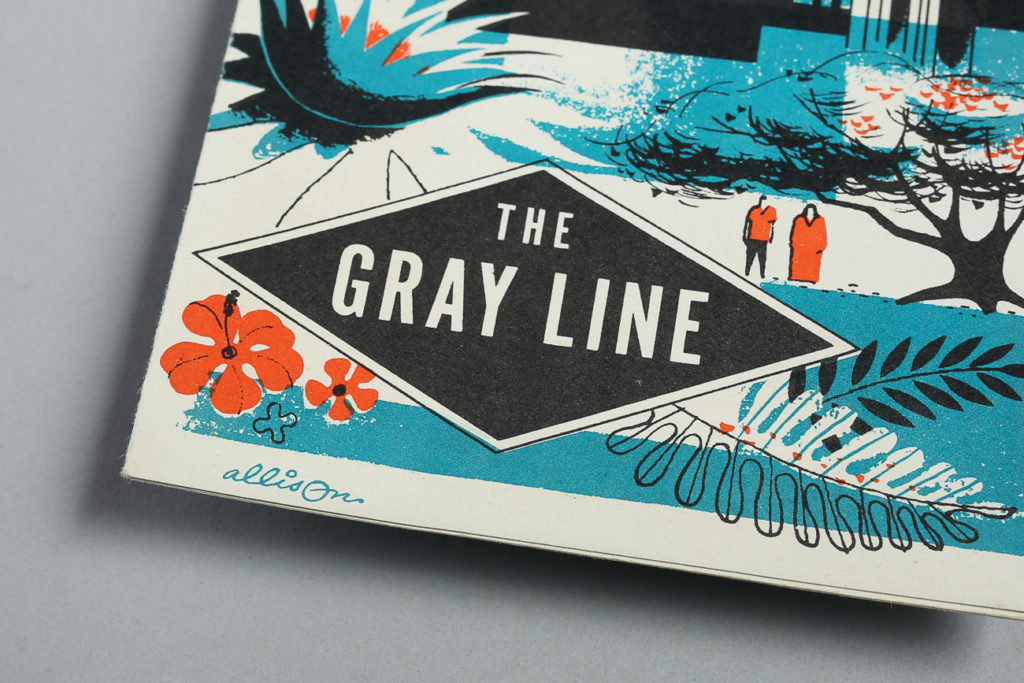
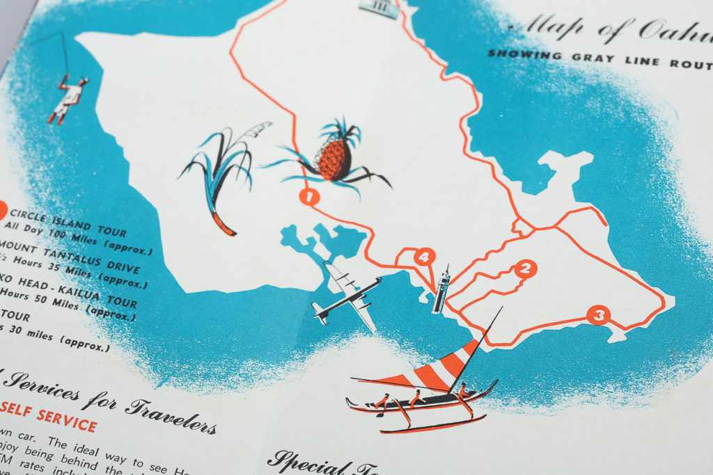
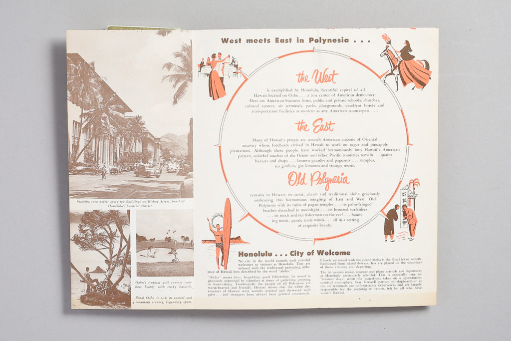
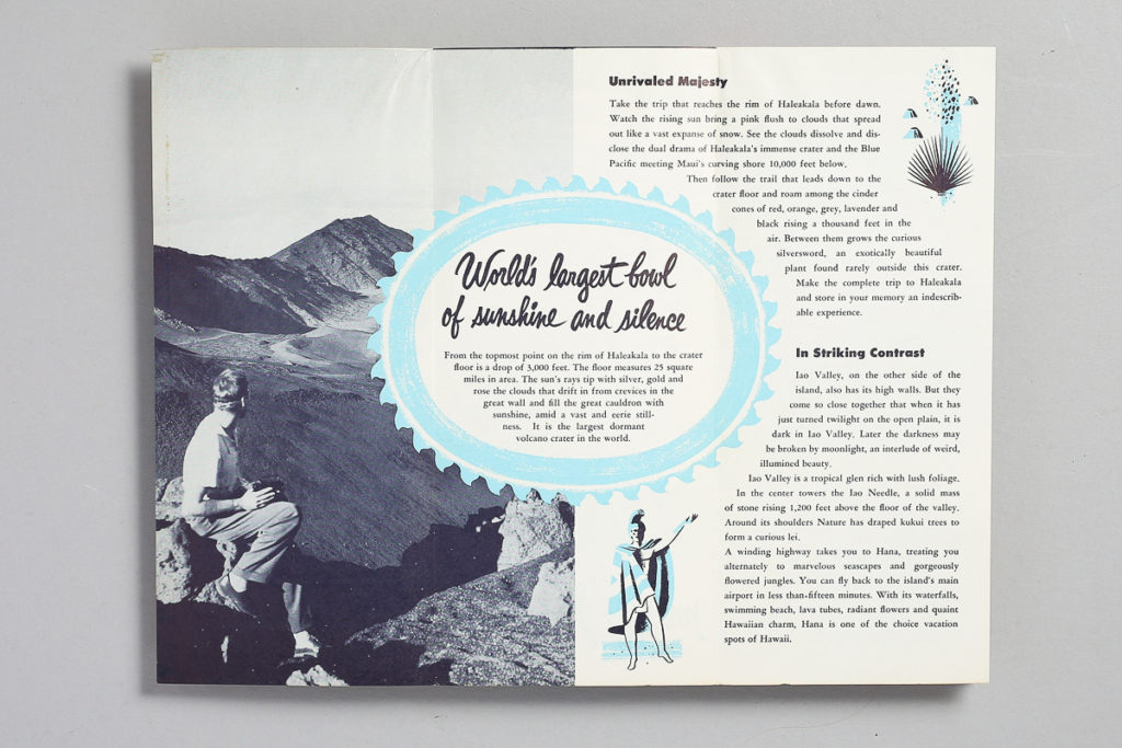
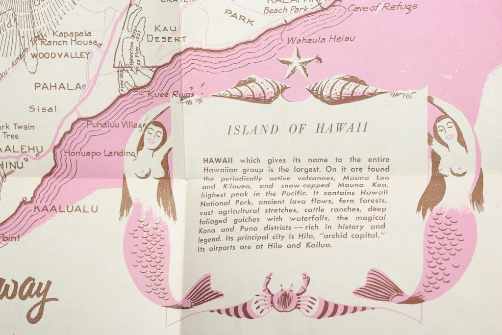
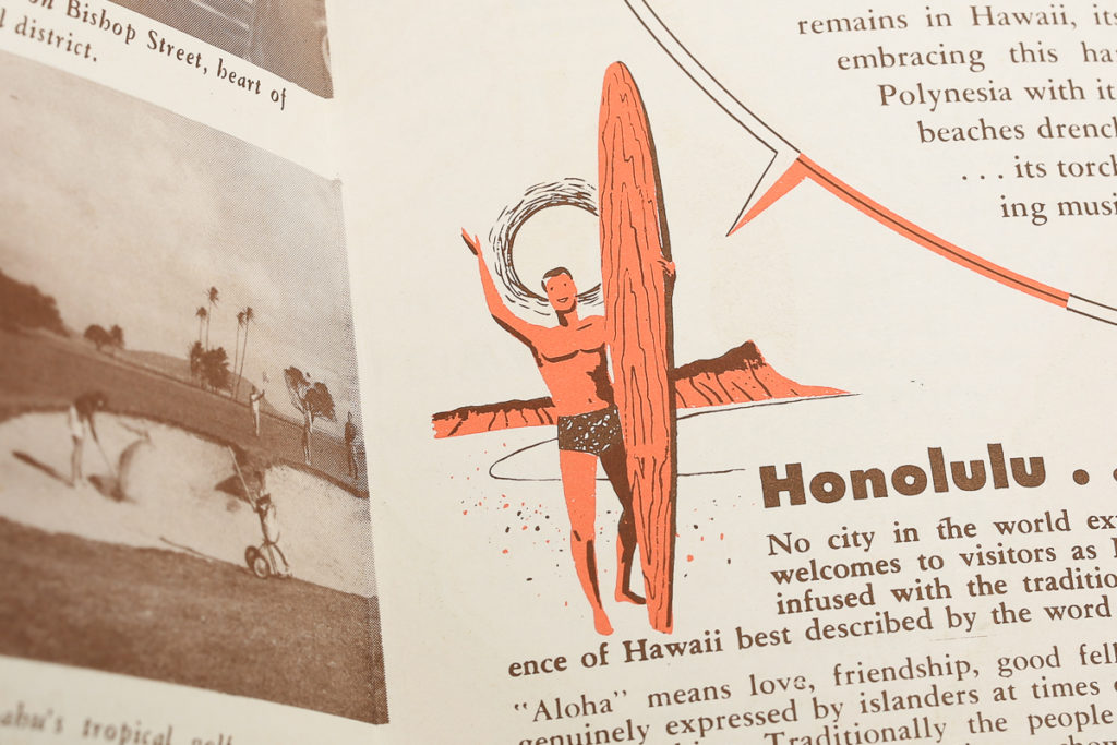
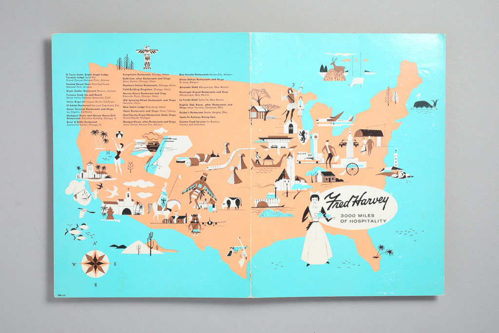
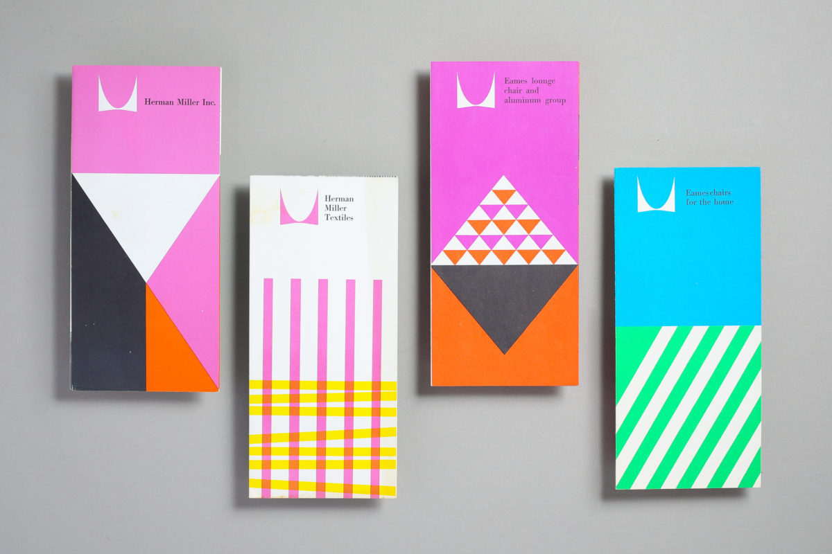
Here are four Herman Miller trifold brochures from 1960 featuring furniture and textiles by Ray and Charles Eames, George Nelson and Alexander Girard. I’ve had these in the ephemera archive for some time now. I’ve posted a snippet of them but I photographed the insides to show them as flat layouts. These were designed at George Nelson’s office and the designers involved were Irving Harper, Don Ervin, Tony Zamora and Dick Schiffer. Not sure which one is assigned to each of them but they work perfectly as a set and I just love the vibrancy of them. Again digital photos will never to this justice as they are way more vibrant in person and the use of overlays is hard to see digitally but here’s an attempt to document this in the blog. Enjoy!

It’s My Beer

Here’s a fantastic whimsical beer label for My Brewing Company in Omaha, Nebraska. The beer is called “It’s my beer. Very unusual compared to most serious looking labels of the time. It features four illustration settings, my favorite being the bottom left with the dude sitting on a Butterfly chair with a bullet planter (Someone was into modernism). The type was very fitting to the illustrations as well with featuring common typeface choices of the era with the inline type, the sans serif and the script. The name is also very unusual (and hard to research). If you know more about this beer let us know. I’ve seen the can version of this but I was lucky to find an unused label. The colors don’t show well in the photos but they are metallic. Enjoy!

Seeing Honolulu by Donn Allison

I wasn’t lying when I said there was a lot of Hawaiiana coming. This one is by Donn Allison, one of Hawaii’s most notorious illustrator/designers of that era. I have a few of his pieces as well as some that are not signed but it could be easily him. Like this one. He has a very distinct almost geometric style and a very good sense of color simplification/abstraction. As usual these brochures were printed in pantone colors and it’s so satisfying to see specially since you rarely see pantones being used on something as simple as this.

El Pescado

This is a fantastic brochure from a series on nutrition informational from the Comisaría General De Abastecimientos y Transportes (Government Produce and Transport Association) produced in Spain during the 70’s. They are in Spanish and they were illustrated by F. Martínez Chaves . The illustrations are just phenomenal. It’s a mix between hard shapes and rough lines. Remember, this is pre-procreate or vector. I have a few of these and they are filled with illustrations that are just too much to feature in one post. Circa 1973. More to come. Enjoy.

Hawaii Travel Brochures

Ok, I hope you are ready for some Hawaiiana because I’ve collected quite a few things. This is a set of travel brochures highlighting a few Hawaii islands including, Kauai, Oahu, Maui and possibly more but these are the only ones I found. They are offset printed in spot colors and just filled with wonderful illustrations. The artist is not listed and there are no signatures but it could possibly be Donn Allison, a prominent Hawaiian artist as the style is quite similar. No dates that I can find but it’s very 1950’s. They were put out by the Hawaii Visitors Bureau. Enjoy.

Fred Harvey Menu

Remember the Harvey Girls with Judy Garland? This is the restaurant that inspired the movie. It is a menu design for Fred Harvey restaurants that were once a famous chain of eateries that served railroad depots. This one is from El Tovar Hotel in Grand Canyon, Arizona. The menu is titled 300 miles of hospitality and it’s an illustrated map depicting their locations. It’s filled with awesome illustrations in 4 colors, my favorite is the cow. Nothing beats the quality of offset solid spot colors, this thing is vibrant. The inside is not that exciting. I’ve had this for a while and this was probably the post that should have followed my last about five years ago. There’s a 4-64 number on the corner and considering the restaurant was open from 1939 – 1967, I’d say it’s circa 1964. Here’s a link from the Los Angeles Conservancy with a bit on the restaurant’s history if you’d like to read about it.