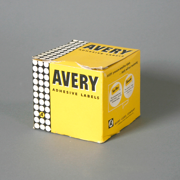
I haven’t featured packaging in a while so here’s a fun one. It’s for Avery Label Company. I love the white space, solid colors, bold type and that bar of circles on the left is ace. The designer and year is unknown but I do know that the Avery logo was beautifully redesigned by the great Saul Bass in 1990 so from the printing I and aging I can see on this piece, I’d say it’s from the 60’s but that’s just my guess. In any case, I hope you enjoy this post!
Fun fact: there’s a logo on the back that reminds me of the Krispy Kreme logo but it says Kum-Kleen, does that sound weird?
Design: Unknown | Year: Unknown | Photo: Javier Garcia


