Dewit Push Button Moistener

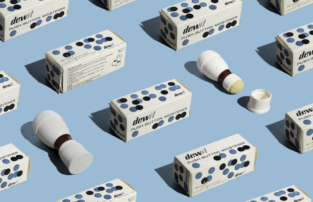
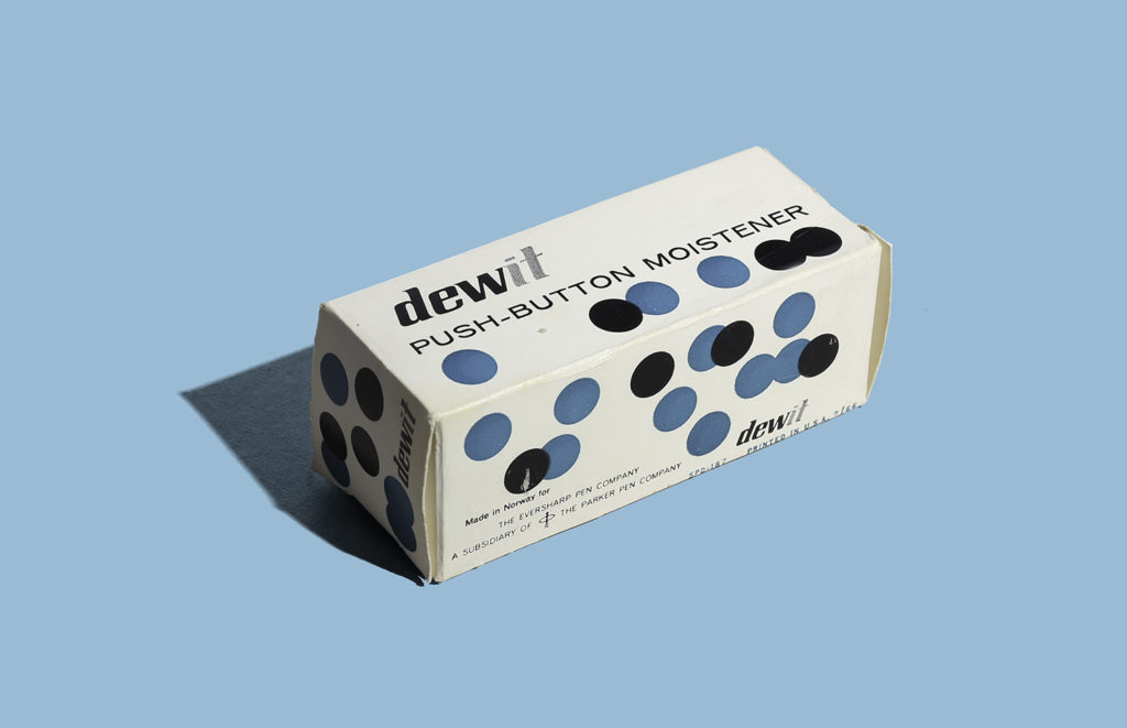
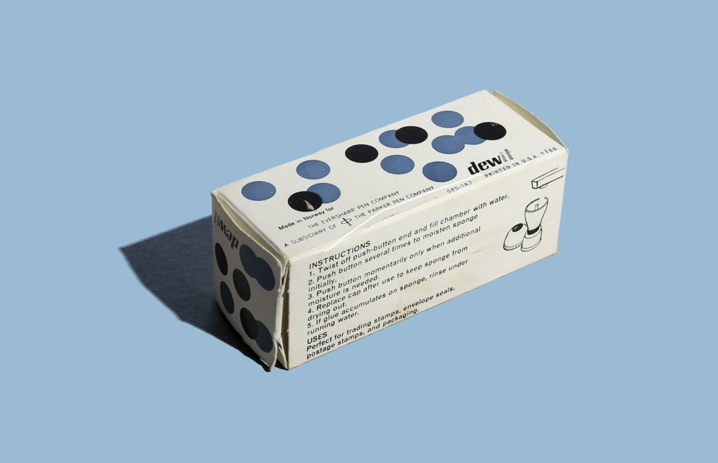
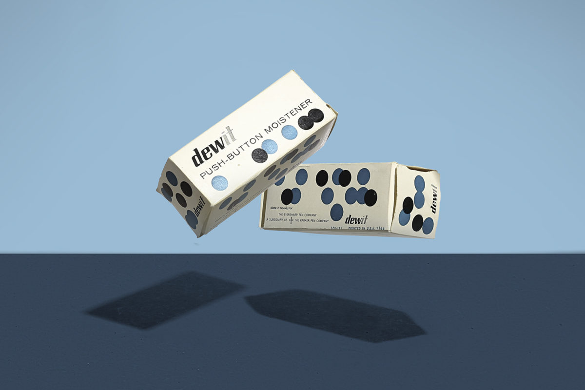
Here’s a fantastic piece of packaging that has inspired me in things that are coming but that’s another story. I instantly gravitated towards the dots which in this case I can not see how this can conceptually relate to the product other than what the action of pushing a button looks like (but that a far stretch). What I love is that back then, packaging was more fun because there weren’t that many established rules, standards and factors to packaging as there are now (unfortunately). But this makes such a boring product look fun and I’m sure it stood out on shelf.

This product was made in Norway for The Eversharp Pen Comapany, a subsidiary of The Parker Pen Company. Printed in USA 1966. I wonder if the packaging was designed in Norway.

It’s My Beer

Here’s a fantastic whimsical beer label for My Brewing Company in Omaha, Nebraska. The beer is called “It’s my beer. Very unusual compared to most serious looking labels of the time. It features four illustration settings, my favorite being the bottom left with the dude sitting on a Butterfly chair with a bullet planter (Someone was into modernism). The type was very fitting to the illustrations as well with featuring common typeface choices of the era with the inline type, the sans serif and the script. The name is also very unusual (and hard to research). If you know more about this beer let us know. I’ve seen the can version of this but I was lucky to find an unused label. The colors don’t show well in the photos but they are metallic. Enjoy!

Household Gloves Fuller Packaging

Here’s a fun packaging for household gloves made by Fuller Brush Co. It has some fun illustrations of ladies cleaning the house which of course wouldn’t fly with today’s standards but hey the illustrations are nice. The flowers, the glove and the type made me pick up this example of Mid Century Packaging geared towards the fine women of that era. There is no date but I’d say this is from the 1950’s. Enjoy!

Design: Unknown  |  Year: 1950?  |  Photo: Javier Garcia

Sweetheart Sparkles Straws Packaging circa 1950’s

Here’s a fun packaging for Sweetheart Sparkles Straws made by Divisions of Maryland Cup Corporation. They are colorful transparent dinking straws that display nicely through the die cut window in the shape of a cup. I really like how they arranged the type in the stem of the cup. There’s no date on this thing but the type and shapes totally scream 1950’s. Enjoy!

Design: Unknown    |    Year: 1950’s?     |   Photo: Javier Garcia

Table Tennis packaging by Milt Herder

Here’s a fun packaging designed by Milt Herder for Pressman Toy Corp, New York. The colors, the thick type and the hand drawn faces makes this piece so much fun. Because of the graphics and because the company went through a name change in 1942, I’m going to date this to the late 40’s.The box was in such bad shape but I still thought it was worth showing. Enjoy!

Design: Milt Herder  |  Year: 1940’s?   |  Photo: Javier García

Blair Spray-Fix Packaging circa 1949

Here’s a funky packaging for Blair Art Products from Memphis Tennessee. It’s a low odor spray fixative with a very lighthearted and fun feel. I wish their products looked less serious as they look today, specially for products with artist as their main target audience. Anyway, really love the funky illustrations on the front and back, although the front guy looks like he’s enjoying the smell of it quite too much. Beautiful script type on the front as well. I’m going to take a wild guess and date this to the late 40’s based on this little history page which states spray fixatives were introduced in 1949. Enjoy!

Design: Unknown  |  Year: 1949  |  Photo: Javier Garcia