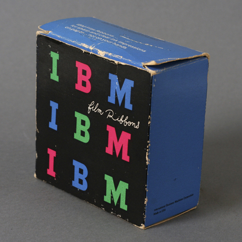
You can never go wrong with Paul Rand. Here’s a beautiful colorful example of IBM’s packaging for Film Ribbons and Carbon Paper. Love the contrast of the handwritten font against the bold IMB type. Oddly enough, I found the carbon paper mingling through my dad’s office one day. Still wrapped. Enjoy!
Update: Typedeck did some search and dated this product to mid 60’s. Thanks Typedeck!
Design: Paul Rand | Year: Mid 1960’s | Photo: Javier García


love paul rand. graphic design history!
What’s not to love about him. I’m always impressed when I hear him talk in the videos floating around the internet. Smart man!