Jerome Snyder, Prokofiev Record Cover

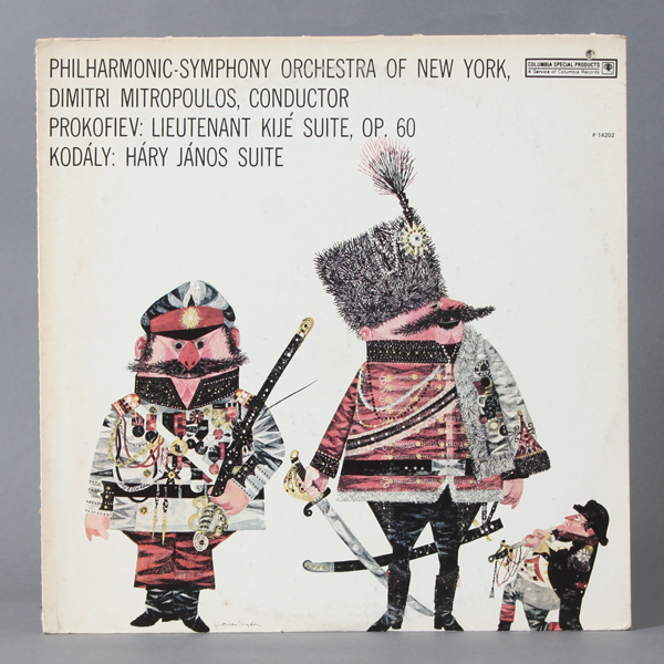
To follow up the popular Book of bridge post, here’s a fun record illustrated by Jerome Snyder. I saw this in a 1957 Annual and I knew I had to track this record down. Finally got a copy of it and I love it. The details on the character jackets are amazing. Enjoy!

Design: Jerome Snyder | Year: 1957 | Photo: Javier García

You might also enjoy this Jerome Snyder Book of Bridge post »

When not to DIY by Stan Fraydas

Here’s a fun booklet titled “When not to do it yourself” illustrated by Stan Fraydas written by Theodore Irwin. It’s a two color piece with wonderful whimsical illustrations depicting people working at home. The illustrations have a lot of interesting textures as well as a wonderful style. Enjoy!

Design: Stan Fraydas   |   Year: 1955   |   Photo: Javier García

Neuhausen am Rheinfall, Swiss Map

Here’s an interesting brochure for the Rhine Falls in Switzerland. It definitely has that Swiss style. I love the condensed typeface as well as the bright overprint purple color. Unfortunately, no design credits. The only credit I see reads, Fotos: Müller, Neuhausen am Rheinfall.  Enjoy!

Design: Unknown | Year: Unknown | Photo: Javier Garcia

Avery Adhesive Labels Packaging

I haven’t featured packaging in a while so here’s a fun one. It’s for Avery Label Company. I love the white space, solid colors, bold type and that bar of circles on the left is ace. The designer and year is unknown but I do know that the Avery logo was beautifully redesigned by the great Saul Bass in 1990 so from the printing I and aging I can see on this piece, I’d say it’s from the 60’s but that’s just my guess. In any case, I hope you enjoy this post!

Fun fact: there’s a logo on the back that reminds me of the Krispy Kreme logo but it says Kum-Kleen, does that sound weird?

View more packaging posts »

Design: Unknown | Year: Unknown | Photo: Javier Garcia

New York in Spring by Jan Balet c1961

Here’s a fun New York calendar of events booklet/brochure that I am very excited to post. I really love the illustrations. I had a hard time figuring out the cover signature but thanks to A La Modern we figured it was indeed Jan Balet — a renown German/US-American artist — which I definitely see his style present in this piece. The style of the inside is very close to Bill Charmatz. (You might like this post as well) But the designer is uncredited except for the signature closeup I posted at the end. So do yourself a favor and google his name and burn a few minutes of your time. Enjoy!

Design: Unknown | Year: 1961 | Photo: Javier Garcia

The Bible speaks by Dan Bar-Giora

Here’s an interesting rendering of the bible for kids. It was printed in the Netherlands in 1965. Love the illustration, the bright colors and the limited palette. There’s quite a modern feel in this piece. Textures and background shapes are very interesting. Enjoy!

* Posted for illustration purposes, please refrain from religious comments.

Design: Dan Bar-Giora   |   Year: 1965   |   Photo: Javier García