Hail to the King!

Just an illustration I did about the things that happens around a King’s Kingdom.
There’s good, there’s evil and they all fight for nothing but power using the poor Princess as an excuse becase the queen is too old. Print?

Up on Flickr », few closeups on dribbble » and also updated on my site »

Mexico 68 Olympics and Mexico 70 World Cup

México is celebrating today. Their national soccer teams have given fans something to enjoy (while it last) so I thought it would be nice to post these postcards.

My mom collected these cards at the time of the 1968 Olympics and the 1970 Soccer World Cup. And they were just recently brought to my attention. They are a mix of screenprinting and flocking. They feel very nice to the touch.

While the designer of all these cards is unknown, there are some graphics from Lance Wyman including that pink card with the Olympics icons and the beautiful México 68 logo.

Design: Lance Wayman (Adapted from?)   |  Year: 1968, 1970   |   Photo: Javier García

Erik Nitsche, Stravinsky/Hindemith 10″ LP

Here’s an Erik Nitsche designed 10″ LP for Decca Gold Label Series. It is an Stravinsky/Hindemith LP conducted by Thomas Scherman and played by the Little Orchestra Society. It has some spot varnishes that were hard to capture on photo but I really like how abstract and organic this piece is. Enjoy!

Design: Erik Nitsche   |    Year: Unknown   |   Photo: Javier García

The Fictitious Records by Javier Garcia

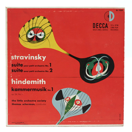
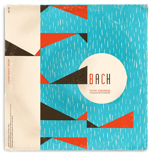
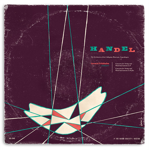
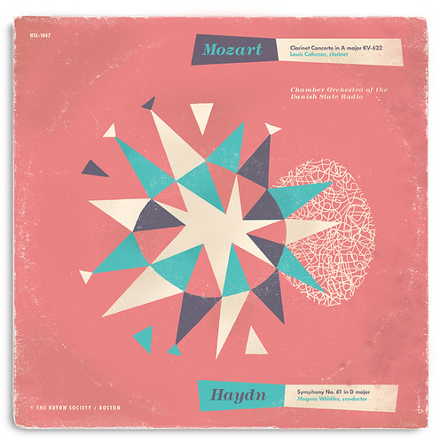
Nope, these are not existing records I found. This is a self-initiated experimental project that I designed myself. I started this project about a year ago. I’ve been collecting The Haydn Society records for quite some time now and I decided to do my take on it. This was totally fictitious and I did not intent to redesign or make the records any better than they already are.

One of my biggest influences for this was one of The Haydn Society collaborating artist (and one of my favorite designers), Alvin Lustig. When thinking of designing this his way, I couldn’t help but to grab a ruling pen, compass, brush and some india ink.

Process was very simple. The text was taken from actual albums. It was totally experimental and I did not set deadlines so I doodled covers for over a month every time I had a spare minute. Then selected the covers and inked them by hand with india ink and scanned them. I then took my black india ink and did some color separations. Color and type was then added on the computer. Yup, that was it.

Overall I had a lot of fun doing this and I really hope you enjoy these covers!

Design: Javier García   |   Year: 2011

Continue reading “The Fictitious Records by Javier Garcia”