Joseph Low — Master Pieces of Music (Haydn Society)

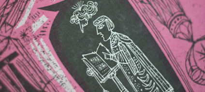
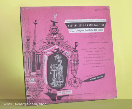
This is one of my favorites from his covers for the Haydn Society. They are three volumes on an anthology with some of the Haydn artists including Finn Viderø, Aksel Schiøtz, Else Brems, Niels Brincker, etc.

The drawings are very ornamental yet geometric and again textured. A lot of fun details on this illustrations contrasted with some bright colors. Another wonderful two color design.

Design: Joseph Low  |  Year: 1953  |  Photos: Javier García

More images after the jump…

Continue reading “Joseph Low — Master Pieces of Music (Haydn Society)”

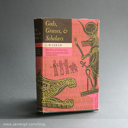
Low – Gods, Graves & Scholars

low-gods_4.jpg

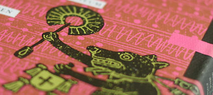
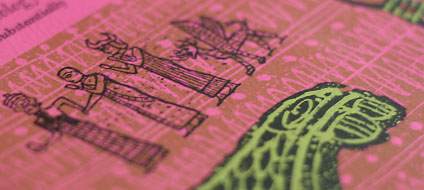
Another design by Joseph Low. I couldn’t skip this one again. The photo does not do it justice. Like the Haydn Society records I have, this book is best viewed in person. The quality of the printing, the mix of overprinting colors, etc. made this 3 color book scream to me from the shelve.

Other pieces of his work posted: Master Pieces of Music, Bach/ Finn Videro, Bach / Finn Videro 2, Bach, Buxtehiude and Haydn.

Design: Joseph Low  |  Year: 1953  |  Photos: Javier García

low-gods_3.jpg

low-gods_2.jpg

Automatic Pancaker

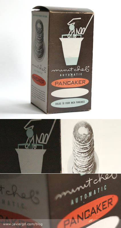
I just found this awesome atomic age pancaker in it’s original packaging. Although it’s not the most functional thing, it is fun to work with and it looks great.

The packaging is very cool. Love the colors and the typography. It’s so cool how the three ovals are bellow the pancaker drawing symbolize the pancakes and at the same time play very well with the type. A completely Atomic Age explosion. The photo of the pancake is classy, why show a full color photo as they do now days? Some people may argue that it doesn’t look appetizing, etc but to be honest it doesn’t bother me at all. I just hate how today’s packaging looks. Full of color, full of gradients, full of layers and layers of crap when back in the days they put a lot of thought into a two or three color job, creating new colors out of overprints, using patterns, etc. to create shades. Now days designers just throw stuff on to the design without using their heads.

It’s 100% made in USA (product and printing). 3 Color Offset. The designer is unknown. If you’d like to share some info, please do.

Design: Unknown   |   Year: Unknown   |   Photos: Javier García
Harry Rogers for Qantas

harry_rogers-1

harry_rogers-2

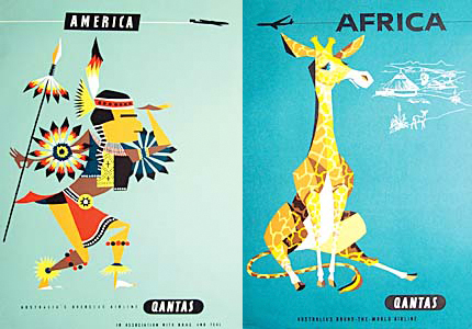
Here are some amazing posters designed by Harry Rogers that I’ve been meaning to post but I’ve been procrastinating to scan them. Luckily I just found them online through this site »

They were commissioned by Qantas as an advertising campaign promoting overseas destinations to Australian travelers between the 1950-1970’s. The illustrations and colors are amazing and inspiring.

They are being sold through Airways Art as giclée prints signed by the artist. I’m not a big fan of giclée prints but I would have bought one if they were screen printed.

Design: Harry Rogers   |   Year: 1950-1970   |   Photos: Found Here »