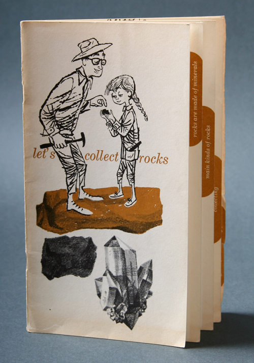

Here’s an 18 page brochure made by Shell Oil Company about the hobby of collecting rocks. It goes quite deep into explaining the fun facts of this hobby and has wonderful illustrations all over.
Design: Unknown | Year: 1960 | Photo: Javier García


A blog about vintage modern design & illustration curated by Javier Garcia
Here’s an 18 page brochure made by Shell Oil Company about the hobby of collecting rocks. It goes quite deep into explaining the fun facts of this hobby and has wonderful illustrations all over.
Design: Unknown | Year: 1960 | Photo: Javier García
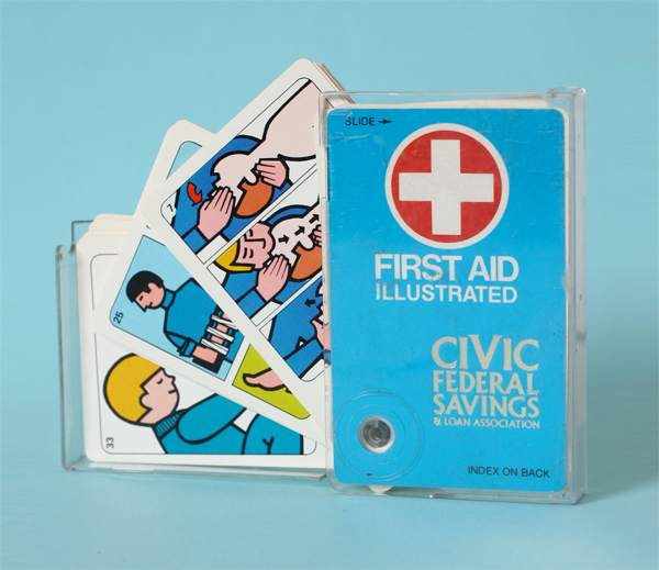
Here’s a set of cards that Illustrate First Aid procedures made in 1976 by Esselte Products (GEMACO). Illustrator/designer is not mentioned anywhere but they are very cool, 70’s illustrations. Enjoy!
Design: Unknown | Year: 1976 | Photo: Javier García


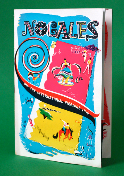
For this 5 de Mayo post, here’s a fun little brochure titled “Nogales, On the International Pleasure Line.” It is filled with fun illustrations and maps promoting both north and south borders of Nogales, Arizona and Nogales, Sonora. It was designed by Cabat-GIll Advertising Agency in Tucson, Arizona. Funny thing is the brochure ends with a text that reads “For further information, write to: PANCHITO”. Ha! yes, just like that.
Design: Cabat-Gill Ad Agency | Year: Unknown | Photo: Javier García


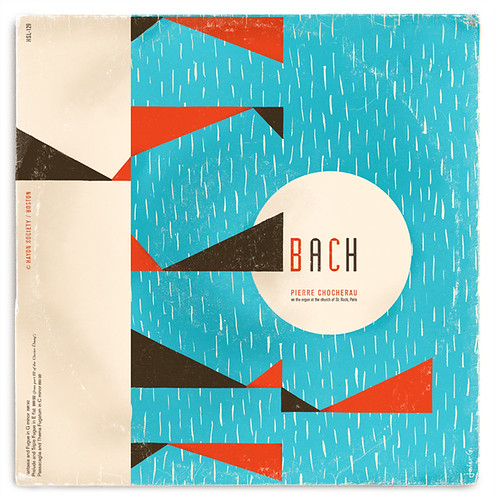
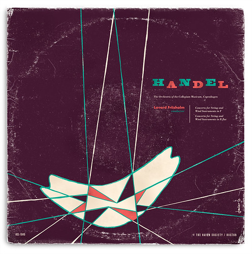
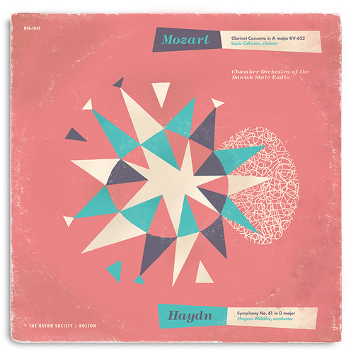
Nope, these are not existing records I found. This is a self-initiated experimental project that I designed myself. I started this project about a year ago. I’ve been collecting The Haydn Society records for quite some time now and I decided to do my take on it. This was totally fictitious and I did not intent to redesign or make the records any better than they already are.
One of my biggest influences for this was one of The Haydn Society collaborating artist (and one of my favorite designers), Alvin Lustig. When thinking of designing this his way, I couldn’t help but to grab a ruling pen, compass, brush and some india ink.
Process was very simple. The text was taken from actual albums. It was totally experimental and I did not set deadlines so I doodled covers for over a month every time I had a spare minute. Then selected the covers and inked them by hand with india ink and scanned them. I then took my black india ink and did some color separations. Color and type was then added on the computer. Yup, that was it.
Overall I had a lot of fun doing this and I really hope you enjoy these covers!
Design: Javier García | Year: 2011
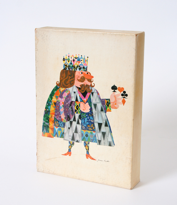
To keep up with my last Stig Lindberg playing cards post, here’s the 1961 Sports Illustrated Book of Bridge written by Charles Goren and illustrated by Jerome Snyder. He was a Self-taught and self-made illustrator who became Sport’s Illustrated first Art Director in the 50’s.
It’s a very thick hardback book, mostly heavy on the text with a slip case. Snyder’s illustration appear as chapter openers. Slip Case is printed in four colors and the inside is black and red with a middle section in four color. As usual if you haven’t heard of Jerome Snyder, google him and drool…
Design: Jerome Snyder | Year: 1961 | Photo: Javier García
You might also enjoy this Jerome Snyder Record Cover »


More images after the jump…
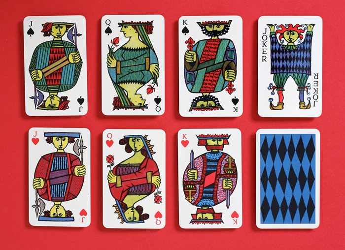
Here’s my absolute favorite set of playing cards designed by the Swedish ceramic designer, Stig Lindberg. He was not only a ceramist but a glass designer, textile designer, industrial designer, painter, and illustrator.
This set is absolutely amazing. Each suit set (clubs, diamonds, hearts and spades) has a different illustration with a great amount of detail. I really love all his work and specifically fond of this particular set which took me a while to get a hold of. I hope you enjoy this one as much as I did.
Design: Stig Lindberg | Year: 1958 | Photo: Javier García
If you haven’t seen the El Al playing cards designed by Jean David I’d recommend you take a look.


