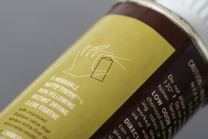
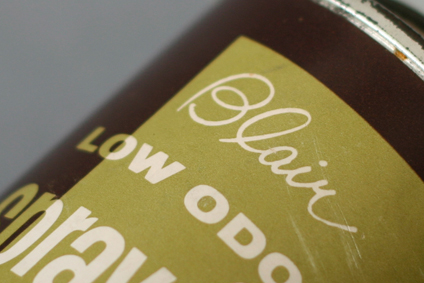
Blair Spray-Fix Packaging circa 1949

Here’s a funky packaging for Blair Art Products from Memphis Tennessee. It’s a low odor spray fixative with a very lighthearted and fun feel. I wish their products looked less serious as they look today, specially for products with artist as their main target audience. Anyway, really love the funky illustrations on the front and back, although the front guy looks like he’s enjoying the smell of it quite too much. Beautiful script type on the front as well. I’m going to take a wild guess and date this to the late 40’s based on this little history page which states spray fixatives were introduced in 1949. Enjoy!

Design: Unknown  |  Year: 1949  |  Photo: Javier Garcia
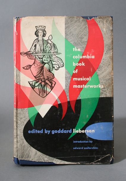
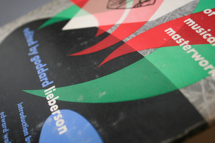
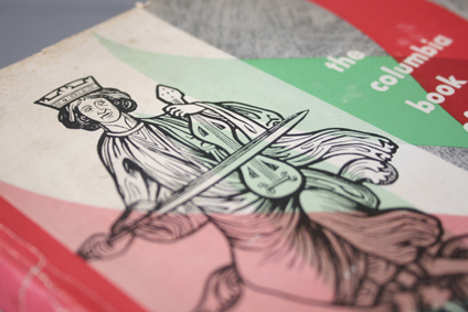
Columbia Masterworks Book cover by Alex Steinweiss

Here is a book cover designed by Alex Steinweiss titled “The Columbia Book of Musical Masterworks” in 1947. I normally think record covers when I think of Steinweiss so when I saw this book, I snagged it right away. As usual there is a nice play with type, image and texture. Enjoy!

Design: Alex Steinweiss   |   Year: 1947   |   Photo: Javier Garcia
Miguel Aceves Record cover by Jim Flora

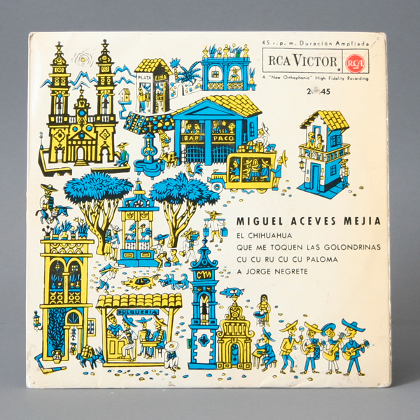
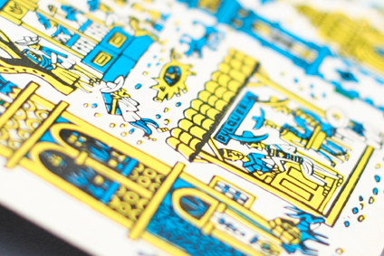
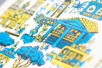
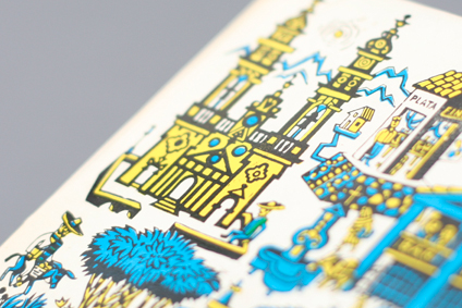
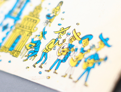
Well this weekend is México’s Independence Day and I thought I’d do a theme post so here’s a super fun record cover illustrated by the absolute wonderful Jim Flora. I love how he managed to include all the folklore of a traditional Mexican celebration. There’s the lady cooking outside, a bar, a pulqueria, a church, plata (silver), and animals including pigs, rosters and of course donkeys!

This is a different color version from the U.S. release. This one was released in Spain. The artwork is identical of the U.S. release but the colors and the RCA logo area are different.

So if you like delicious food, drinks and folklore, make sure you look for some of these festivities this weekend. Enjoy!

Design: Jim Flora   |   Year: 1955   |   Photo: Javier Garcia
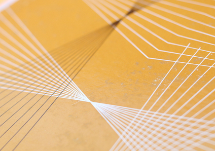
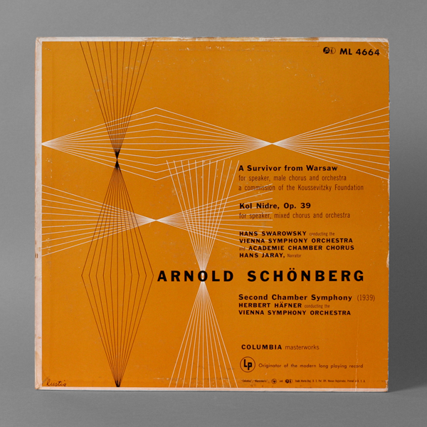
Schönberg record cover by Alvin Lustig

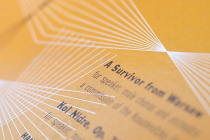
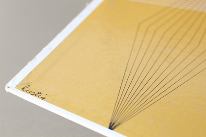
This is a very rare record cover designed by Alvin Lustig that I haven’t seen around that much. It’s not in the book, nor the site at this time. I really love his geometric line explorations and this one is certainly one of my favorites of his. It is an honor for me to share it with all of you.

I am very excited to finally post this cover and I am happy to say that, as I am typing this, this particular record among a few others is being shipped to Minneapolis for the exhibit titled “The Lustigs: A Cover Story” curated by Michael Skjei at the College of Visual Arts Gallery. The exhibition will be up from September 19 through October 21, 2012 with Steven Heller (Author of Born Modern: The Life and Design of Alvin Lustig) as a guest Lecturer and a conversation with the wonderful Elaine Lustig Cohen. For more details visit the CVA Gallery page »

So if you are in the area make sure you don’t miss this event as – from what I’ve heard from Michael –  it will probably be one of the most complete exhibits of the work of the Lustigs you’ll ever see. Enjoy!

Design: Alvin Lustig   |   Year: 1953  |  Photo: Javier Garcia
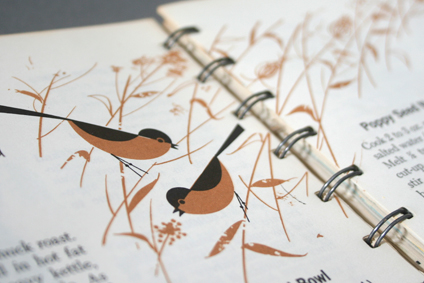
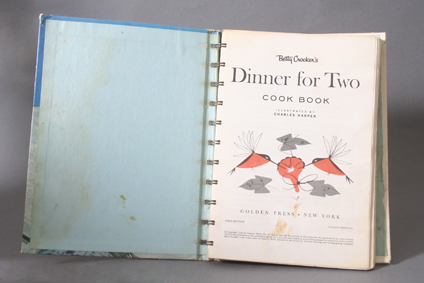
Charley Harper Cookbook Giveaway!

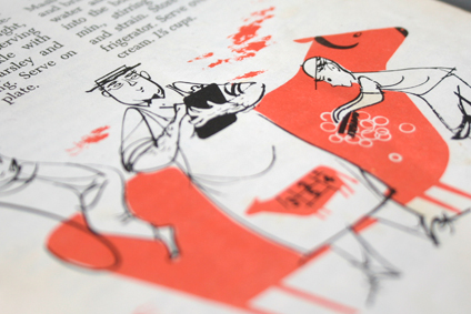
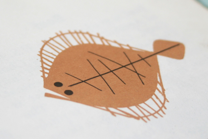
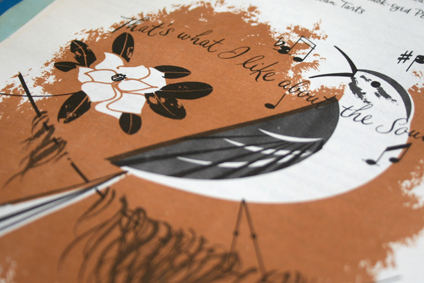
I just didn’t quite get to do some Spring cleaning this year and some duplicate books are accumulating on my collection so I thought of giving away this exact copy of the beautiful Betty Crocker cookbook fully illustrated by the wonderful Charley Harper. The book is titled “Dinner for two” and it’s a small book of 207 pages, measuring roughly 5.75″ x 7.75″ The book is filled with fun illustrations all over.

You have a few options to enter:

  1. Leave a comment on this blog post and let me know if you’d be interested in another give away.
  2. Tweet the following message “Hey @javiergdesign count me in for the Charley Harper cookbook giveaway http://www.javiergd.com/blog/?p=1595 #design”
  3. Follow me on Twitter at @javiergdesign. (anyone who followed me starting August 27th is in)
  4. Leave a comment on this Flickr photo »

You can try a few of these to increase your odds. I will ship this anywhere in the world (as long as it can get there). I will randomly select a winner on and announce it on Friday August 7th 2012.

I hope you guys like this and if everything goes well I’ll have some other stuff to give away in the future. Stay in informed by following me on twitter at @javiergdesign or subscribe to the blog RSS feed.

Enjoy!

Design: Charles Harper  |  Year: 1958   |   Photo: Javier García

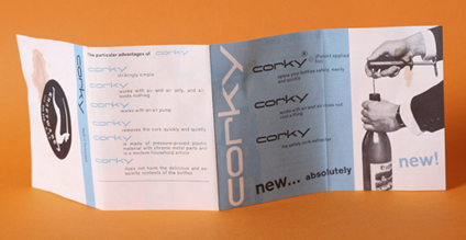
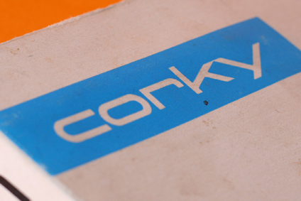
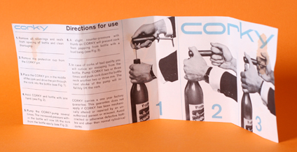
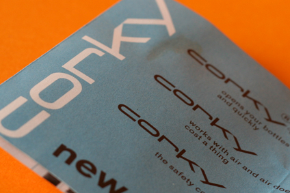
Corky packaging circa 1960’s

Here’s a fun and minimal two color packaging for a Swiss Corkscrew that is technically a Cork Remover since it works with air pressure. The logo and the typography are very fun and modern as well. I will assume the design of the packaging is Swiss as well since the product is made in Switzerland. I will date the design to 1960’s for the look of it. One funny thing is that in the little booklet there’s a line that reads “works with air and air does not cost a thing”.  Enjoy!

Design: Unknown   |   Year: 1960’s?   |   Photo: Javier García