
Just to keep up with the lion motif, this one is for Stephan Lion Inc., a Manhattan-based graphic art and communication studio. Here’s another variation on it: somuchpileup »
Design: Stephan Lion Inc. | Year: 1970 | Photos: Scanned
A blog about vintage modern design & illustration curated by Javier Garcia
Just to keep up with the lion motif, this one is for Stephan Lion Inc., a Manhattan-based graphic art and communication studio. Here’s another variation on it: somuchpileup »
Design: Stephan Lion Inc. | Year: 1970 | Photos: Scanned

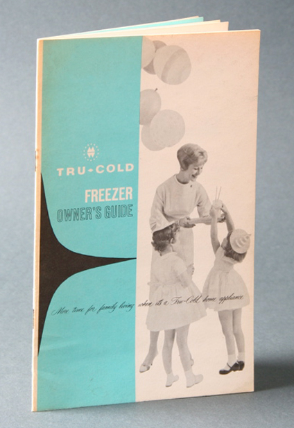


Here’s another fun booklet by Tru-Cold exclusive with Montgomery Ward. It’s an owner’s manual in two colors with nice use of white space. Don’t know why but that shape on the back (also on the front) gives my a sort of “Herman Miller Logo” feel. Doesn’t look like it but perhaps the curves give it this modern feel. Anyhow, great booklet. Enjoy!
Designer: Unknown | Year: Unknown | Photos: Javier García
More images after the jump…

Whimsical logo for Little Majesty, infant clothes.
Design: Morton Goldsholl and John Webber of Goldsholl Associates
Year: 1960 | Photos: Scanned
See more of Morton Goldsholl here »
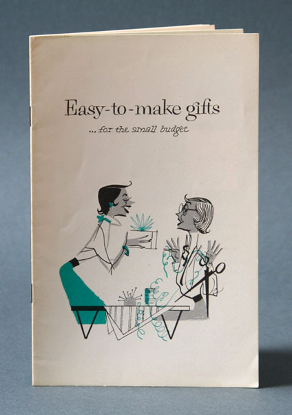
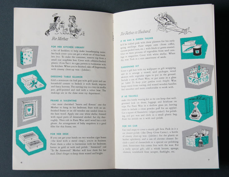
Here’s a fun booklet titled “Easy-to-make Gifts…for the small budget” to get the Holiday spirit going. Nice little illustrations in two colors. As always looks better in person but thought I’d share with all of you. Click on images to enlarge.
Design: Unknown | Year: 1957 | Photos: Javier García


More images after the jump…


Another quick snap from my cell. I really like how they treated type back in the days, specially hand made textures and patterns. Here’s a good example from an old record cover that didn’t get to come with me.
Design: Unknown | Year: 1957 | Photos: Javier García

Here’s a nice ad designed for Bit-Ilo by Claude Humbert (Bureau de Publicité Humbert) in Switzerland around 1958. Titled Automation.
Design: Claude Humbert | Year: 1958 | Photos: Scanned