ABG Standard Staples Packaging

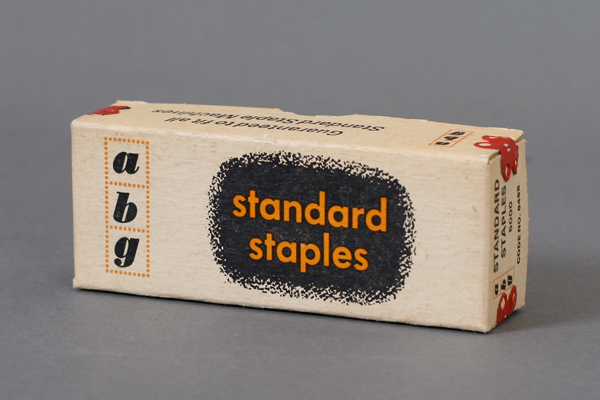
Here’s a fun staples packaging. It’s got great type, layout and awesome textures. It uses two of my favorite typefaces, Bodoni (Poster Italic) and Futura. Yup, that’s basically why I picked it up! It’s just a staples packaging, who cares right? Apparently people cared more back then. Try to find something like this in the store now. Enjoy!

Design: Unknown | Year: Unknown | Photo: Javier García

Strauss Record Cover by Jerome Snyder

Here’s another amazing record cover designed by the wonderful Jerome Snyder. This one is for the Philadelphia Orchestra. As usual the complexity of his textures and patterns is beyond belief. Truly a work of Mid Century Modern Art. Enjoy!

You might be interested in seeing my other Snyder posts: Book of bridge » and Prokofiev Record Cover »

Design: Jerome Snyder  |  Year: Unknown  |  Photo: Javier García