Bethoven LP by Emil Antonucci

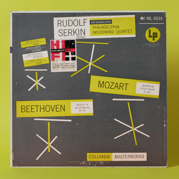
Here’s a very modern cover designed by Emil Antonucci for those lovers of clean Sans Serif type. The the yellow/green is pretty vibrant and definitely a color not used a lot around that time. Love the random arranged yet structured type. The only thing that is not part of the design is the HIFI label. Even though the label is nice by itself, I hate that they slapped it anywhere on the LP’s. Enjoy!

Design: Emil Antonucci  |  Year: 1954   |   Photo: Javier García

Beckman Helipot Packaging

Here’s a super fun and modern piece of packaging for Beckman Helipot – a biomedical/scientific instruments company. This is one of my favorite packaging pieces I’ve found. Love how clean and minimal the type is plus the colors are incredible. Unfortunately, I do not know much about the designer of this piece. All I know is that it was printed in the U.S. and from reading on wikipedia, the company changed its name in the 50’s to Beckman Instruments, Inc. which is written on the instructions of this piece. So I date this to the 50’s. Feel free to pitch in. And again, try to find something as cool as this in the medical device bin today… Enjoy!

Design: Unknown   |   Year: 1950   |   Photo: Javier García

IBM Packaging by Paul Rand

You can never go wrong with Paul Rand. Here’s a beautiful colorful example of IBM’s packaging for Film Ribbons and Carbon Paper. Love the contrast of the handwritten font against the bold IMB type. Oddly enough, I found the carbon paper mingling through my dad’s office one day. Still wrapped. Enjoy!

Update: Typedeck did some search and dated this product to mid 60’s. Thanks Typedeck!

Design: Paul Rand  |  Year: Mid 1960’s  |  Photo: Javier García