Inked Ribbon Packaging

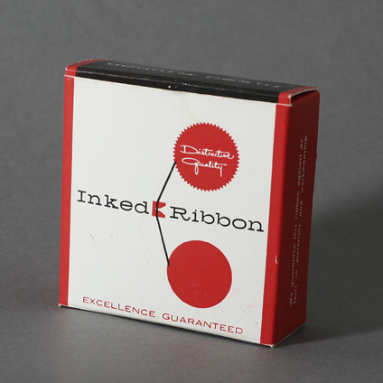
Here’s a fun packaging for typewriter’s Distinctive Quality Inked Ribbons. I love the type and layout. Very modern. No traces of the designer or it’s year but based on the fact that this ribbon is for a Smith-Corona typewriter that fits 60’s models, I’d date this thing to 1960. Enjoy!

Design: Unknown | Year: 1960? | Photo: Javier García

Triad Distributor Packaging circa 1961

As usual even the smallest piece of electronic had nice around it. Triad is an electronics pioneer that made products since the 50’s.  This is a very bright, two color design with very simple logos around it. Check out Triad’s archives of their catalogs »

They even kept the original logo on that page. So judging from the catalogs, I see this package graphics introduced in 1956 but I don’t see the additional logos (Litton) until 1961 so I’m going to go ahead and date this to 1961.

Design: Unknown  |  Year: 1961  |  Photo: Javier Garcia

This last image via Triad Catalog Archives »

Beckman Helipot Packaging

Here’s a super fun and modern piece of packaging for Beckman Helipot – a biomedical/scientific instruments company. This is one of my favorite packaging pieces I’ve found. Love how clean and minimal the type is plus the colors are incredible. Unfortunately, I do not know much about the designer of this piece. All I know is that it was printed in the U.S. and from reading on wikipedia, the company changed its name in the 50’s to Beckman Instruments, Inc. which is written on the instructions of this piece. So I date this to the 50’s. Feel free to pitch in. And again, try to find something as cool as this in the medical device bin today… Enjoy!

Design: Unknown   |   Year: 1950   |   Photo: Javier García

ABG Standard Staples Packaging

Here’s a fun staples packaging. It’s got great type, layout and awesome textures. It uses two of my favorite typefaces, Bodoni (Poster Italic) and Futura. Yup, that’s basically why I picked it up! It’s just a staples packaging, who cares right? Apparently people cared more back then. Try to find something like this in the store now. Enjoy!

Design: Unknown | Year: Unknown | Photo: Javier García

IBM Packaging by Paul Rand

You can never go wrong with Paul Rand. Here’s a beautiful colorful example of IBM’s packaging for Film Ribbons and Carbon Paper. Love the contrast of the handwritten font against the bold IMB type. Oddly enough, I found the carbon paper mingling through my dad’s office one day. Still wrapped. Enjoy!

Update: Typedeck did some search and dated this product to mid 60’s. Thanks Typedeck!

Design: Paul Rand  |  Year: Mid 1960’s  |  Photo: Javier García