Alvin Lustig Bach Vivaldi

lustig_bach_2

lustig_bach_3

Here’s another Haydn Society record from my all time favorite, Alvin Lustig. This cover is very simple yet very different from the others. The circles make it look very modern and minimal while at the same time it helps reiterate the two composers distinction by changing its color.

Hope you all enjoy this as much as I do and stay tuned for more…

Designer: Alvin Lustig   |   Year: ?   |   Photos: Javier García

King Solomon

king_0.jpg

king_1.jpg

king_2.jpg

Here’s a great example of design from the early 60’s for the King Solomon Restaurants. The identity wonderfully integrated into exterior signs, menus, packaging and more. I love how the square Extended Eurostyle typeface integrates with the shapes if the icon.

Enjoy!

Design: Sy Edelstein   |   Year: 1963   |   Photos: Scanned/Unknown

Automatic Pancaker

I just found this awesome atomic age pancaker in it’s original packaging. Although it’s not the most functional thing, it is fun to work with and it looks great.

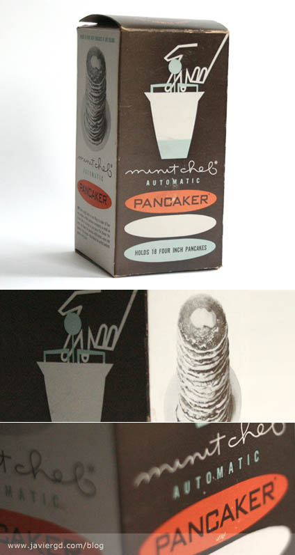
The packaging is very cool. Love the colors and the typography. It’s so cool how the three ovals are bellow the pancaker drawing symbolize the pancakes and at the same time play very well with the type. A completely Atomic Age explosion. The photo of the pancake is classy, why show a full color photo as they do now days? Some people may argue that it doesn’t look appetizing, etc but to be honest it doesn’t bother me at all. I just hate how today’s packaging looks. Full of color, full of gradients, full of layers and layers of crap when back in the days they put a lot of thought into a two or three color job, creating new colors out of overprints, using patterns, etc. to create shades. Now days designers just throw stuff on to the design without using their heads.

It’s 100% made in USA (product and printing). 3 Color Offset. The designer is unknown. If you’d like to share some info, please do.

Design: Unknown   |   Year: Unknown   |   Photos: Javier García

Alvin Lustig PostWar Architecture

Here’s another wonderful book designed completely by Alvin Lustig. Amazing Layouts and typography is showcased in this book not to mention all the great architects featured in it. The photo’s tonal range is exceptional due to the heliogravure process.

Book was made in 1952 by The Museum of Modern Art, New York.

Design: Alvin Lustig   |   Year: 1952   |   Photos: Javier García

Remo Drum Head Packaging

I just found this great packaging for Remo’s Drum Heads. Inside was a receipt dated 1986. The designer is unknown (anyone?), but the simplicity, shapes and colors are very fun to look at. I’ve seen some recent redos of this packaging and they do not come any close to this. Why did they change their package?

Design: Unknown   |   Year: Unknown   |   Photos: Javier García