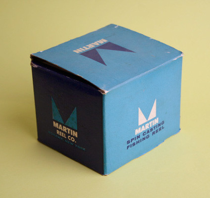
Here’s a fun box. I like the colors and the simplicity of it.
Design: Unknown | Year: Unknown | Photos: Javier García


A blog about vintage modern design & illustration curated by Javier Garcia
Here’s a fun box. I like the colors and the simplicity of it.
Design: Unknown | Year: Unknown | Photos: Javier García


I just found this great packaging for Remo’s Drum Heads. Inside was a receipt dated 1986. The designer is unknown (anyone?), but the simplicity, shapes and colors are very fun to look at. I’ve seen some recent redos of this packaging and they do not come any close to this. Why did they change their package?
Design: Unknown | Year: Unknown | Photos: Javier García
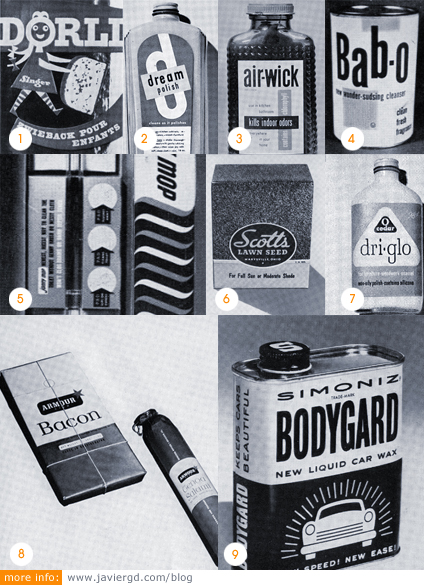
Here are some scans from a great source of inspiration. It’s from the Ladislav Sutnar book “Package Design: The force of Visual Selling”. I’m posting some of my favorites but the whole book is amazing.
It seems that back then packaging was way more typographic with a lot of solid colors and negative space or at least they were more open to it. Right now packaging is full of warnings, nutritional facts, messages everywhere, gradients, etc. We should go back to simple design.
1. Singer’s ‘ Dörli ‘ zweiback package designed by Rolf Rappaz [Basel].
2. Atkins ‘Dream Polish’ designed by Ladislav Sutnar [1946].
3. ‘Air-Wick’ label designed by Paul Rand [Seeman Brothers, 1953].
4. ‘Bab-o’ cleanser experimental package by Paul Rand [B. T. Babbitt Inc., 1953].
5. ‘Johnny Mop’ toilet bowl cleaner [Personal Products Corporation, 1952].
6. Scotts Lawn Seed. [O. M. Scott & Sons Co., 1952].
7. O-Cedar ‘Dry-Glo’ designed by Raymond Loewy Associates [1952].
8. ‘Armour Star’ coordinated package design with dominating trademark, designed by Raymond Loewy Associates.
9. Simoniz ‘Bodygard’ liquid car wax designed by Lester Beall [1951, 1950].
Design: Various (see above) | Year: Various | Photos: Scanned/Unknown