Swedish bank Money box by Kjell Westerlund

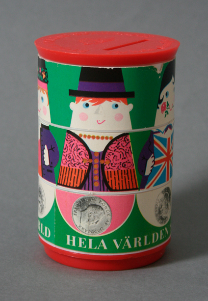
This is a fun little money bank created by the swedish designer and illustrator Kjell Westerlund in the sixties for the swedish bank Sparbanken. This is often mistaken for a Stig Lindberg design but that is wrong. I really love the illustrations which have a double function. You can mix up the characters for fun and you can adjust all three rings to a certain position to open it. So this time I’d say illustration follows function. Enjoy!

Design: Kjell Westerlund     |     Year: 1960’s     |   Photo: Javier García

P.G. Wodehouse Book cover by Olle Eksell

Here is a book cover designed and Illustrated by the swedish designer Olle Eksell. This was found all the way in Stockholm, Sweden and I was very excited to scavenge a copy of this magnificent book. The illustrations and colors in combination with the custom typography makes this cover vibrate with joy. Unfortunately the book is in swedish so I won’t get to read it. Enjoy!

Design: Olle Eksell   |   Year: 1952   |   Photo: Javier Garcia

Inked Ribbon Packaging

Here’s a fun packaging for typewriter’s Distinctive Quality Inked Ribbons. I love the type and layout. Very modern. No traces of the designer or it’s year but based on the fact that this ribbon is for a Smith-Corona typewriter that fits 60’s models, I’d date this thing to 1960. Enjoy!

Design: Unknown | Year: 1960? | Photo: Javier García

Jim Flora Disc Digest Booklet circa 1946

Here’s a fun booklet filled with Illustrations all over. It’s for Columbia Records. I’m going to go ahead and label this as a Jim Flora piece since he was in charge of most of the Columbia Records materials at the time and the style of illustration matches that of Flora’s earlier career. I know that George Maas and Robert Jones also illustrated some Disc Digest issues. Please feel free to correct me if I am wrong. This one is from a record store in San Francisco. Enjoy!

UPDATE: Thanks to the wonderful Irwin Chusid — who is an expert in this subject — we now know that only the cover was designed by Jim Flora.

Design: Jim Flora | Year: 1946 | Photo: Javier García

Dining Out In the Country NYC circa 1954

This booklet is a guide to eating in the suburbs and country in New York City put out by the New York Herald Tribune in 1954. Cover and back cover have some fun two color illustrations. The inside has mostly generic maps and text. The style of illustration looks very familiar but it’s unfortunately not credited. Enjoy!

Design: Unknown   |   Year: 1954   |   Photo: Javier García

Triad Distributor Packaging circa 1961

As usual even the smallest piece of electronic had nice around it. Triad is an electronics pioneer that made products since the 50’s.  This is a very bright, two color design with very simple logos around it. Check out Triad’s archives of their catalogs »

They even kept the original logo on that page. So judging from the catalogs, I see this package graphics introduced in 1956 but I don’t see the additional logos (Litton) until 1961 so I’m going to go ahead and date this to 1961.

Design: Unknown  |  Year: 1961  |  Photo: Javier Garcia

This last image via Triad Catalog Archives »