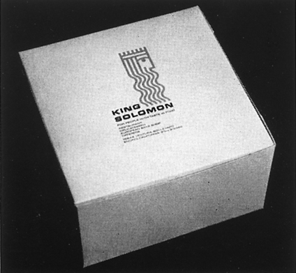
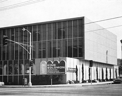
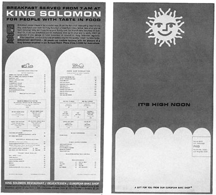
Here’s a great example of design from the early 60’s for the King Solomon Restaurants. The identity wonderfully integrated into exterior signs, menus, packaging and more. I love how the square Extended Eurostyle typeface integrates with the shapes if the icon.
Enjoy!
Design: Sy Edelstein | Year: 1963 | Photos: Scanned/Unknown